Author Archives: Christen Janine Otter

About Christen Janine Otter

Graduate student at Rowan U. pursuing my M.A. in Writing Arts, with an emphasis in Creative Writing and New Media.

Perspectives On Ergodic Literature Within The Field Of Writing

As I wrote in my prior reflection about the creation of Topaz Galaxies, generative poetry is a completely different form of composition and experience than that of traditional, print-based literature—even nonlinear, print-based literature at that. Ergodic literature is distinctive in both its composition process and the reading, or interaction with it. Espen Aarseth, author of Cybertext: Perspectives on Ergodic Literature defines ‘cybertext’ as, “the wide range of (or perspective) of possible textualities seen as a typology of machines, as various kinds of literary communication systems where the functional differences among the mechanical parts play a defining role in determining the aesthetic process” (p. 13).

This said, when approaching eLit, or cybertext, or ergodic literature, we must first recognize our expectations and biases that are subconsciously carried over from prior experience with print-based literature. For example, one expectation could be that the narrative must “make sense” in terms of its use, placement, or arrangement of channels of language (i.e., words, phrases, numbers, punctuation, etc.) Typically, we  approach a piece of writing thinking we are supposed to ‘get something out of it’, and the ‘thing’ we are supposed to get out of it  has been (mostly) pre-determined and pre-designed for us. (Just think of novels, newspaper articles and poetry. Most, on some level, operate within the framework of information transmission; and in line with this structural dynamic, the human act of  ‘reading’ is simply the exchange we make to get the message that the text contains.

Now, the metaphor for ergodic literature is more like what occurs in a dream-state: we are constructing meaning as we interact within the dream and simultaneously we are also constructing the dream itself. Using generative poetry for example, the meaning is created by the complex process of interacting with the text on multiple levels. Aarseth writes, “There is a short circuit between the signifier and the signified, a suspension of difference that projects an objective level beyond the text, a primary metaphysical structure that generates both textual sign and our understanding of it, rather than the other way around” (p. 3).  Looking closer at the transmission/translation process, which occurs inside the mind of the user and stems from the combination of physical, sensory experience and the technical nature of the medium: “During the cybertextual process, the user will have effectuated a semiotic sequence, and this selective movement is a work of physical construction that the various concepts of “reading” do not account for. This phenomenon I call ergodic using a term appropriated from physics that derives from the Greek words ergon and hodos, meaning “work” and “path” (p. 2-3). And, it is from this perspective that Aarseth introduces the concept of “nontrivial effort” (p. 2) on the part of the reader, which is decidedly different than what a person engages in when they read a book or a magazine—and, I would argue, even literature that is consumed in a digital space but constructed in a structure lent from a static, print-based ideas.

Now, examining the production and consumption of texts, and thus of literature, within the context of digital spaces, we must ask the question: can ergodic compositions and other forms of cybertext truly be considered literature?

If we examine the outworkings of culture, we see the creation and evolution of phenomena like the genre, for example.  Just as art imitates life, genres are birthed as offspring of a particular era, and they reflect the experience and values of the people. My point being: we can’t simply dismiss forms of expression because they don’t neatly fit within the construct of canonized works. When we relegate forms of composition to a place illegitimacy, it is often because we have approached them with misplaced expectations that (usually unintentionally) carry over from previous interactions, whose mental paradigms are rooted in constructs that are alien to the work at hand. But alas, culture evolves. And so do ways of communicating and interacting.

Franco Moretti, in his book Graphs, Maps, Trees, (2005) discusses abstract models for literary history; he argues, (quoting Mentre), “The aesthetic sphere [and thus, I would argue, the arts] is perhaps the most appropriate to reflect overall changes of mental climate” (p. 21). Further, regarding cultural evolution, Moretti argues that a ”generation style” depends entirely on “the trigger action of the social and cultural process” (p. 21).  Nelson, in Computer lib/Dream machines argues that the computer is a “projective system” and writes, “The things people try to do with movies, TV, and the more glamorous uses of the computer, whereby it makes pictures on the screens—are strange foldovers of the rest of the mind and heart. That’s the peculiar origami of the self” (p. 305).  In our emergent culture, we can conclude that technology, and thus electronic literature (eLit), are manifestations of society. Therefore, when we examine digital works, it should be with the intent of discovering changes in our social topographic landscape. As Aarseth argues, “If these texts redefine literature by expanding our notion of it . . . then they must also redefine what is literary, and therefore they cannot be measured by an old, unmodified aesthetics” (p. 13).

In sum, these new kinds of literature are already literature simply because they are external manifestations of a present cultural current; and that current is active and alive, evolving and growing—whether we want to acknowledge it as being legitimate or not in the canonized sense. If we can appreciate electronic literature by placing ourselves within its ecology, we can then perhaps begin to awaken our faculties to expressions that were already present within us, but were never given voice to because the external apparatus (conduit) wasn’t yet realized.  But now, we have a whole new playing field.

Sources

Aarseth, E. (1997). Introduction: Ergodic literature. In Cybertext: Perspectives on Ergodic Literature. Baltimore, MD: Johns Hopkins University Press. Retrieved from http://cv.uoc.edu/~04_999_01_u07/aarseth1.html. [pdf]

Moretti, F. (2007). Graphs, Maps, Trees. London, New York: Verso.

Nelson (1974, 1981). Computer lib / Dream machines. In N. Wardrip-Fruin (Ed), The new media reader (pp. 303 – 338). Cambridge, MA: The MIT Press. [pdf]

Categories: elit, ergodic literature, information architecture | Tags: , , , , , , , , , | Leave a comment

An Exploration in Generative Poetry: “Topaz Galaxies”

Creating a generative poem was both fascinating and challenging–fascinating to see the end result, and challenging because I had only a vague idea of how the text would appear on screen. Composing “Topaz Galaxies” was my first experience writing a code poem. So, to gain a frame of reference for understanding this mode of composition, I examined my experience upon viewing Chuck Ryback’s  “Tacoma Grunge“. What I observed was that, through his choice of words and phrases that have a particular connotation/cultural reference, Ryback was able to paint a picture of 1990’s urban culture in America.

A screenshot of Chuck Ryback's Tacoma Grunge

A screenshot of Chuck Ryback’s Tacoma Grunge

Since code poems lend to the experience that is created while viewing the digital narrative, I saw an opportunity to create something that “reads” the way a dream feels–since the narrative in code poetry is nonlinear and associative in nature. If you’d like to see my generative poem, check it out here: “Topaz Galaxies”  (I’ve also linked to it in a few other places throughout this post, so feel free to read on.)

When brainstorming and revisiting some of my own experiences, one particular memory that surfaced:

Waking up from a nap on the beach, still half drowsy, I’m wrapped a blanket of warmth. Slowly emerging from my lazy state, I am greeted by the rolling echo of ocean waves and golden afternoon light dancing and glinting on ocean waves.

There is something deliciously surreal about the experience. Maybe it’s the quality of the light, the rhythmic crash of waves, the gauzy glow of everything. I’m not sure. At any rate, there is something captivating that I want to explore. The experience of drawing from my own memory was a little like squinting and trying to make out the shape of a figure in a mirage. It wasn’t easy, but it was certainly fascinating and rewarding, especially once I saw the pieces come together in the browser.

A screenshot of my generative poem, "Topaz Galaxies"

A screenshot of my generative poem, “Topaz Galaxies”, initial color scheme.

A screenshot of my generative poem, "Topaz Galaxies" final version with revised color scheme.

A screenshot of my generative poem, “Topaz Galaxies” final version with revised color scheme.

Due to the subtle nuance of experience I was attempting to draw from, it was challenging coming up with a large word-bank. For example, some of the words that appear in the first lines in unindented stanzas are:  Sojourner, Sons of Thunder, lampstands, terrible army. Some of the words below these words are: sounds of the wings, sapphire expanse, resurrection balm, earthquake; verbs interacting with these two sets are: whispering, blazing blazing, glowing, dripping; textures are: airy, glinted, velvet, misty.

As the author of “Topaz Galaxies“, I have to say that composing in a digital medium using code has afforded me an experience that carries with it a sense of excitement that is perhaps akin to seeing the big ‘reveal’ of a painting or a sculpture for the first time; it’s exhilarating. The dynamic was not completely unexpected, because I had a bit of an idea how they might turn out, but wow–it was the difference between imaging  something in my mind and then seeing in real life. The fun of generative poetry is that every time you hit the “Refresh” button, a fresh narrative is generated–so try hitting “Refresh” a few times and watch what comes up!

Thanks for reading, and I hope you enjoy “Topaz Galaxies“.

Categories: elit, ergodic literature, generative poem | Tags: , , , , , , , , , , | Leave a comment

Informed Infographics: Using Theory to Support Visual Presentations

“Hurricane Sandy: The Financial Aftermath” infographic presents financial data, statistics, and a personal account in one space, and it examines the financial plight of storm victims in light of the financial assistance they have received through FEMA and insurance policies, compared to the financial loss suffered.

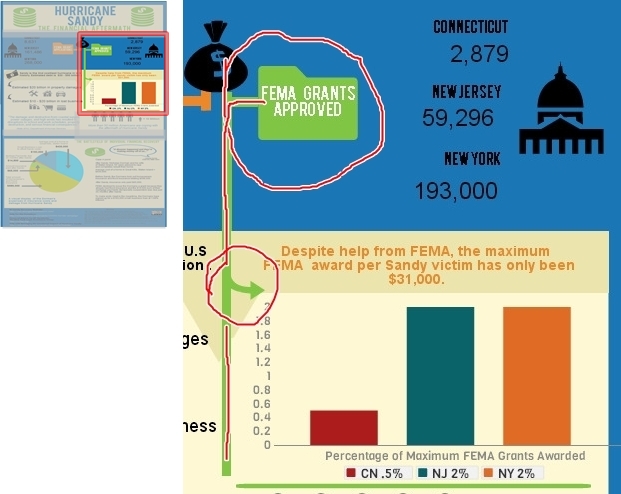
To set up a comparative framework, (as seen in the screenshot below) I contrasted the number of FEMA grant applications sent in from Connecticut, New Jersey, and New York, with the number of FEMA grants that were actually approved for those states respectively. For example, in the upper third of my infographic, I used icons to help convey different kinds of information:  the folder icon for bureaucratic process, the money bag icon for funds, and an icon that resembles our capitol building to represent state government.  Edward Tufte, (2006) contemporary author and expert on the visual display of qualitative and quantitative information, writes in Beautiful Evidence, to place labels directly on images when possible–which in turn helps to reinforce and concretize connections and causal relationships. “For showing evidence, the map metaphor suggests that labels belong on images, that external grids help scale images, and that data are more credible when contextualized” (p. 21). Likewise, I have placed the labels for “FEMA Grant Applications” and “FEMA Grants Approved” directly onto the orange and green folder icons. The names of the states and the numerical data are placed in very close proximity so that they appear as sets of information, easily distinguishable from one another.

Hurricane Sandy: The Financial Aftermath

Tufte instructs, “For explanatory presentations, important comparisons among images should usually be pointed out to viewers by means of annotations, arrows, highlighting, or other methods of directing attention” (p. 45). Therefore, to concretize connections on the page-space, I use different styles of arrows. For example, in the mid-section, the green arrow that flows off of the green line functions to connect the upper portion featuring the data about “FEMA Grants Approved” to the graph which states the exact dollar amount of the Maximum FEMA Grant ($31,000) and the percentage of people in Connecticut, New Jersey, and New York who received the Maximum FEMA Grant Award.

Hurricane Sandy: The Financial Aftermath

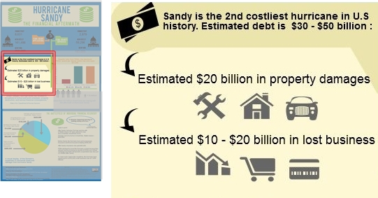
Moving over to the left-hand side of the mid-section, (see screenshot below) I use curved black arrows to connect the first statistic about Hurricane Sandy being the 2nd costliest hurricane in U.S. history to more specific financial data. First, I state that the estimated debt from the storm as being $30 – $50 billion and then just below that statistic I provide a breakdown, ($20 billion in property damages and an estimated $10 – $20 billion in lost business). The arrows are black because the icons are gray; so having a difference in color between the elements helps to break up the visual field and differentiates the arrows from the images.  Here, the arrows not only serve to visually connect the information, but they also create a sense of hierarchy by functioning as bullet points.

Hurricane Sandy: The Financial Aftermath

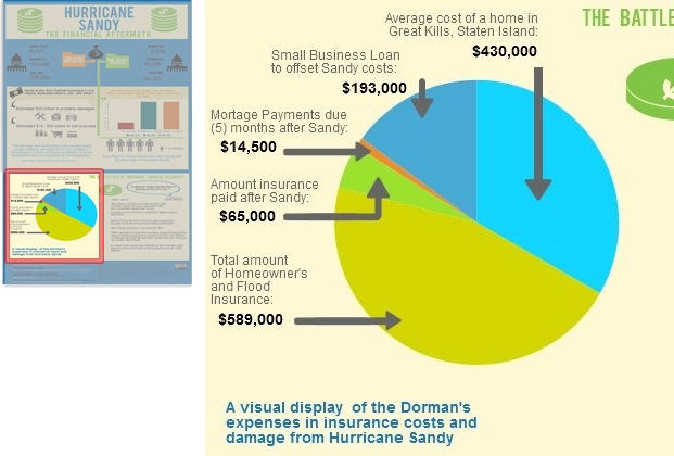
Now, when creating the pie chart to represent the financial aftermath of the storm on an individual level, I had the option to simply connect the financial data to the chart using thin lines in a minimalist style. However, Tufte would argue that, “The more generic the arrows and lines, the greater the ambiguity” (p. 68). So, in line with his ideas, I decided to create customized arrows to help ground the text and numbers to the exact place on the pie chart. Doing so helps to avoid confusion and assists the reader in being able to quickly scan the infographic and see what information is being communicated without having to closely study and dissect the graphic.

Hurricane Sandy: The Financial Aftermath

Ellen Lupton, (2010) author of Thinking With Type, writes, “A typographic hierarchy expresses the organization of content, emphasizing some elements and subordinating others” (p. 132). To create a sense of hierarchy for the bottom third of the infographic, I used the same font for the header, “The Battlefield of Individual Financial Recovery” that I used for the main title, “Hurricane Sandy, The Financial Aftermath”. I made this design choice in order to convey that the information presented is not a continuation of the mid-section, but instead a new set of information. Additionally, I added visual distinction by shading it in green. Just below the header, outlined in a blue speech bubble, is a direct quote from Nicholas Dorman, a Great Kills, Staten Island resident, which serves as a caption: “A disaster happened and they’re making money off of us.” I wanted to use a direct quote from a real person to allow the statistics and financial information a more human feel, which in turn helps the reader to better identify with the case presented.

Some readers are “primarily attracted to pictures and captions, while others prefer to follow a dominant written narrative…” (Lupton, 2010, p. 130). The caption assists in framing the range of financial facts and data in a more local scope and personal context, and it also lets the reader know at a glance specifically what the text is going to discuss. Regarding typographic design choices for pie chart label, I selected a vivid blue in a Helvetica typeface at a size 14 font, bold. These attributes allow the chart label to be easily read while appearing visually soft at the same time, so as not to be appear too heavy or overpowering.  As Lupton writes, “Scale is the size of the design elements in comparison to other elements in a layout as well as to the physical context of the work” (p. 42).

Hurricane Sandy: The Financial Aftermath

Sources

Lupton, E. (2010). Thinking with Type. New York: Princeton Architectural Press.

Tufte, E. (2006). Beautiful Evidence (3rd Edition). Cheshire: Graphics Press LLC.

Categories: infographic, information architecture, technology, tufte | Tags: , , , , , , , , , | Leave a comment

Hurricane Sandy, The Financial Aftermath: An Infographic

I have been researching Hurricane Sandy since it occurred in October of 2012 and have since created a multimodal project that presents the emotional and material aftermath of experience. However, in recent months (currently about 8 months after Sandy), storm victims are still facing extremely difficult financial realities—for many people trying to navigate the gauntlet of insurance policies and FEMA procedures has proven to be an overwhelming task, to such an extent that it has required bringing in legal help from out-of-state skilled in dealing with flood disasters. For example, many storm victims are grappling with the reality that, (unbeknownst to them) if they had insurance prior to the storm, they may be ineligible to receive money from FEMA—or very little at that. And in other cases, insurance companies are denying payment until borrowers can show proof of how the money will be spent. Recovering from the devastation of losing your home, your vehicle, nearly all of your material possessions is hard enough, let alone be denied compensation after having paid thousands in flood and homeowner’s insurance. After hearing about people having to take out loans well into the six-figure range just to float costs while trying to recover, I wanted to bring attention to the crushing circumstances Hurricane Sandy victims are still facing. My infographic highlights the hard-hitting financial reality of the storm on both a broad scale and an individual level.

My infographic, "Hurricane Sandy: The Financial Aftermath" using Piktochart technology

My infographic, “Hurricane Sandy: The Financial Aftermath” using Piktochart technology

For example, in the upper third of my infographic, to represent FEMA and grant money (grant applications and grants approved) I used an icon which resembles a government building. I placed this icon on the left and right sides. Additionally, through the affordance of color and the use of shapes to highlight and connect information, I selected green for “FEMA Grants Approved” and used green lines to further connect the folder icon in the upper third, (“Grants Approved”) to the statistics and chart in middle third, (right side) where I used a chart to highlight facts about the maximum amount of FEMA awards and the percentage of maximum ($31,000) award for New Jersey, New York, and Connecticut. Doing so assists the reader in understanding a more specific reality pertaining to storm victims trying to get help from the government after the devastation–even though thousands did receive help, the amount of help the received is like a drop in the bucket compared to the funds that are actually needed to make a difference.

In conclusion, upon analyzing my process, I was somewhat pleased with the infographic results overall, in light of the fact that this was my first time using Piktochart. However, in retrospect, I think I would have liked to have more expertise in creating charts and visual displays of data. Specifically, I would like to have been able to present the reader with a type of chart that focuses on a comparative relationship. For example, I was able to plug in the figures for the Dorman’s financial facts, (e.g., average cost of home in Great Kills, amount of their small business loan to offset debt and setbacks from the storm, the amount their insurance paid versus the amount their insurance was supposed to cover, etc.,) but I would have liked to somehow compare the funds received as relative to what they were covered for, and the average price of a house in Great Kills, (as their home was destroyed in the storm). Being able to have more control over the visual representations of data in this way would better assist me in portraying the devastating amount of financial loss that many people are currently dealing with. However, I look forward to using Piktochart more in the future and employing this mode of representation which allows my reader to make visual connections with ease and quickly understand complex information.

Categories: infographic, information architecture | Tags: , , , , , , , , , | Leave a comment

Website Analysis: Hailey Winstone Illustration

As part of course requirements to employ the use of social media toward stimulating discussion around relevant topics pertaining to information architecture, my classmate, Wayne Stainrook shared this tweet:

The website belongs to Hailey Winstone Illustration.

Upon clicking the link, I am greeted by the site’s visually-centered homepage. In the background, I see a sample of the illustrator’s work which appears as a faded-watermark. At a glance, the artwork embodies a metaphor that represents elements of the internal (a human brain and eye–thus creativity) and the external (a planet and surrounding outer-space–our world). An affordance of the way the illustrator features her work here is that it draws me in, yet it is not distracting; I also find it meaningful in multiple ways. The navigational interface is placed directly at the center of the screen; it reads concisely with the logo at the top (whose typeface has a customized feel) and directly below are two content boxes which mirror each other in design. The navigation option on the left dares the user: ‘crazy version’ here (enlarged) and just below (in smaller typeface), ‘if you & your machine can handle it…’ the option to the right accommodates: ‘lazy version’ here… for slower computers and connections.’The homepage emotes an interesting sense duality–as its aesthetic is of a bizarre, whimsical nature, juxtaposed by a navigational interface that conveys acuteness in its attention to precision. A win, in terms of design, is that the image and the text do not compete with each other–instead they work to complement the work as a whole.

As author, illustrator and scholar, Edward Tufte asserts, in Beautiful Evidence, most techniques for displaying evidence are inherently multimodal, bringing verbal, visual, and quantitative elements together (83). All components are treated as ‘colleagues in explanation.’

Additionally, I find the initial options to be constructed in such a way that I am directed with visual ease to the offerings. In terms of an effective visual representation, or mapping of the information, the designer maximized the use of color and typography in a way that serves to embody a sense of graphic consistency, yet adds a layer of interest. Specifically, through use of a single color (white) for navigation, the text is crisply highlighted and flows in smooth contrast with the background image. The text (again, all white) is featured in two typefaces–the logo is highly stylized but balanced by navigational text in a classical, yet stylized serif typeface.

So far, so good. I decide to enter the site choosing the ‘crazy version’ option. What happens next is that the background image transforms into a full-color image, (as opposed to the very faded version on the homepage) and as I scroll over the image I discover that the drawing has become interactive. Although not all ‘interactive parts’ of the artwork function as navigation, I enjoy it as an ‘ imaginative experience of discovery,’ and feel that the designer’s intent is to provide an interactive experience for the user, where anything can happen–as there certainly seems to be a sense of the ‘unexpected.’ The user interaction that occurs on this level also serves to reinforce the brand and identity of Hailey Winstone. As I scroll over ‘the eye,’ white ‘click to enter‘ text appears; the eye then looks to the left at a menu offering links for: Paintings, Pen & Ink, Portraits, and Other. Each link (text) is accompanied by a white, graphic (image) that is iconic of what it represents–for example, a classical-looking paint brush graphic is paired with the Paintings link. Thus, the result is quality of resonance as the text and image complement and reinforce one another.

I venture into the Paintings section of the site; there appear 3 rows, each containing 5 thumbnail scroll-shaped images. The first row and (majority) of the second contain illustrations for the book, Mother Holle, by the Brothers Grimm. As you scroll over each thumbnail image, a small bit of descriptive text appears above it. As Tufte asserts, nearly always, the words closely follow the images–and the images closely follow the words…(90).

A strong, consistent theme that the designer employs is the accompaniment of  text to bring specificity, context, and definition to the image-based content. This serves to connect the illustrative subject matter with a specific literary genre–thus giving the illustrations a sense of credibility by connecting them with their market niche. On the bottom row, I thought the relationship between the image and supporting text was of particular interest; the thumbnail depicts a close-up portion of a human face–with fangs. The illustration category is: Christmas Cards, with the description: a Christmas card featuring a scary Santa, and finally the caption: He’s coming for you. As a point of visual connection and associative meaning-making, just left of this image is a thumbnail featuring a classic-looking Santa–therefore, you can form a fairly accurate educated guess as to what the ‘scary Santa’ image is–without actually scrolling it to reveal the supporting text. In sum, I feel that the informational ‘mapping’ of this site exemplifies Tufte’s theory that, mappings help tell why the image matters (45).

Categories: #IAMondays | Tags: , , , , , , , , , , | 3 Comments

Embodied Connections: Meaning-Making in a Multimodal Discourse

This past week in our graduate course on Information Architecture with Professor Bill Wolff, we’ve explored techniques and design philosophies centered on information display. Our discussion was informed by selected readings from Edward Tufte’s  Beautiful Evidence, as well as interactive and PDF versions of  Fighting to Live as the Towers Died, by the New York Times. A specific area of focus was the concept of  ‘mapping,’ within the context of  multimodal composition. (As a preface, it is important to make the distinction that, for purposes of discussion, our definition of mapping is not limited to ‘maps’ in the conventional sense of cartographic renderings–although, it could certainly include the use of them.)

According to Tufte, mapped pictures are representational images that combine scales, diagrams, overlays, numbers, words, and images (13).

Multimodal-mapping presents the audience with several different kinds of information, via a single, visual plane–through a process of layering. Each ‘layer’ serves to signify a different kind of knowledge. For writers, mapping affords a visual dissemination of  interconnected webs of knowledge and causal relationships. In terms of information architecture and as a form of composition, multimodal-mapping frames and contextualizes specific intersections within a greater body of knowledge.

If we reflect on the discipline of communication, as writers, at the heart of our craft is effective communication with our audience. What this means in terms of execution–is that in our ‘writing,’ the intended message should come across in a way that is consistent with precisely what we mean to say. In other words, it is paramount that our composition–and therefore our message–not transmit in a convoluted or disjointed way.

So, you may ask, how does multimodality come into play, and why is ‘mapping’–or incorporating other elements besides plain text–important?

As our author asserts, at times, it is necessary to include multiple sources and levels of data (78) in order to illustrate connections and relationships, as well as make different kinds of comparisons; the use of additional kinds of information assist to better explain what we mean to say. For example, the strategic arrangement of annotative and  typographic elements–lines and arrows–as well as colors, images, and text, all function together to transmit a message that is dynamic, visually engaging and robust. Important to note, is that these elements also function to provide context and directional navigation to the page–therefore, enabling the reader to clearly ‘decode,’ or ‘read’ the message.

Another facet of multimodal-mapping is that it offers the capability to take extremely complex, high-density information–such as that of cartography, brain research, molecular biology, physics and other high-resolution fields–and re-present it in a way that the linear data becomes embodied into a single, compact, visual representation. Tufte refers to this type of visual information as sparklines or data-words (58). This definition lends itself to that of semiotic metaphor. Another way to imagine sparklines or data-words, is to think of a ‘constellation of information’–or individual, interconnected pieces of knowledge that come together, making up a whole. An example of  a sparkline is the double helix of DNA encoding (13) or Tufte’s representation of all 65 of Galileo’s published observations of Jupiter and its satellites. (Pertaining to Tufte’s re-design of Galileo’s work, we note that when the original, ‘intervening’ text was omitted, a new architecture of information presented itself, resulting in the visual evidence becoming adjacent, sequential, linked, moving (108)–a continuity became present that was not there before.)

To further extrapolate on this concept, imagine an illustration of an adult, human skeleton. Now, in order for the message to be clearly understood, specificity is essential–what is needed is clear direction, scope, and scale. With a nod to the author, presenting ‘everything’ results in contextualizing nothing (31)–it conveys a message that is abstruse. So, we don’t want to focus on the ‘whole skeleton’ per say–instead, what we want to focus on is one area. Say, it’s the left leg–and even more specifically, the tibia. According to Tufte’s definition of beautiful evidence, every image presented must reside within the universal measurement grid (45). So, connecting back to the example I discussed above, what we are concerned with, is the portrayal of relationships within a given body of knowledge–showing things in context with one another provides for a local and precise way of understanding.

Tufte also discusses explanatory mappings and the practice of exploratory image analysis. Explanatory mappings appear in scientific research, newspapers, textbooks, technical manuals, legal proceedings, engineering reports and medical research (45). However, they are not constrained exclusively to these fields of discipline; they also extent into the arts and humanities and many times are interdisciplinary, because they represent complex information.

Below is image is from a journal article in Current Opinion in Neurobiology; an example of an explanatory mapping.

Networks for segregation in the human brain.

Below, this image  is a representative time-space map of the USA belonging to an article titled, The shrivelled USA: representing time–space in the context of metropolitanization and the development of high-speed transport from The Journal of Transport Geography.

During a discussion centered on one of the interactive mappings in Fighting to Live, one of my classmates commented, I don’t know when I’m supposed to stop and when I’m supposed to look at the images.

Regarding the page’s architecture of information, my classmate’s comment was reflective of bad design in terms of the page’s directional signifiers. In sum, just as a freeway has road signs and indicators of when to stop and when to go, when to turn here and exit there, multimodal mappings are beautiful evidence of what they represent only when elements therein properly signify or ‘point to’ what they were intended to, and result in a clear transmission of the message.

Categories: evidence, mapping, tufte | Tags: , , , , , , , , , , , , | 4 Comments

Blog at WordPress.com.