Posts Tagged With: information architecture

An Exploration in Generative Poetry: “Topaz Galaxies”

Creating a generative poem was both fascinating and challenging–fascinating to see the end result, and challenging because I had only a vague idea of how the text would appear on screen. Composing “Topaz Galaxies” was my first experience writing a code poem. So, to gain a frame of reference for understanding this mode of composition, I examined my experience upon viewing Chuck Ryback’s  “Tacoma Grunge“. What I observed was that, through his choice of words and phrases that have a particular connotation/cultural reference, Ryback was able to paint a picture of 1990’s urban culture in America.

A screenshot of Chuck Ryback's Tacoma Grunge

A screenshot of Chuck Ryback’s Tacoma Grunge

Since code poems lend to the experience that is created while viewing the digital narrative, I saw an opportunity to create something that “reads” the way a dream feels–since the narrative in code poetry is nonlinear and associative in nature. If you’d like to see my generative poem, check it out here: “Topaz Galaxies”  (I’ve also linked to it in a few other places throughout this post, so feel free to read on.)

When brainstorming and revisiting some of my own experiences, one particular memory that surfaced:

Waking up from a nap on the beach, still half drowsy, I’m wrapped a blanket of warmth. Slowly emerging from my lazy state, I am greeted by the rolling echo of ocean waves and golden afternoon light dancing and glinting on ocean waves.

There is something deliciously surreal about the experience. Maybe it’s the quality of the light, the rhythmic crash of waves, the gauzy glow of everything. I’m not sure. At any rate, there is something captivating that I want to explore. The experience of drawing from my own memory was a little like squinting and trying to make out the shape of a figure in a mirage. It wasn’t easy, but it was certainly fascinating and rewarding, especially once I saw the pieces come together in the browser.

A screenshot of my generative poem, "Topaz Galaxies"

A screenshot of my generative poem, “Topaz Galaxies”, initial color scheme.

A screenshot of my generative poem, "Topaz Galaxies" final version with revised color scheme.

A screenshot of my generative poem, “Topaz Galaxies” final version with revised color scheme.

Due to the subtle nuance of experience I was attempting to draw from, it was challenging coming up with a large word-bank. For example, some of the words that appear in the first lines in unindented stanzas are:  Sojourner, Sons of Thunder, lampstands, terrible army. Some of the words below these words are: sounds of the wings, sapphire expanse, resurrection balm, earthquake; verbs interacting with these two sets are: whispering, blazing blazing, glowing, dripping; textures are: airy, glinted, velvet, misty.

As the author of “Topaz Galaxies“, I have to say that composing in a digital medium using code has afforded me an experience that carries with it a sense of excitement that is perhaps akin to seeing the big ‘reveal’ of a painting or a sculpture for the first time; it’s exhilarating. The dynamic was not completely unexpected, because I had a bit of an idea how they might turn out, but wow–it was the difference between imaging  something in my mind and then seeing in real life. The fun of generative poetry is that every time you hit the “Refresh” button, a fresh narrative is generated–so try hitting “Refresh” a few times and watch what comes up!

Thanks for reading, and I hope you enjoy “Topaz Galaxies“.

Categories: elit, ergodic literature, generative poem | Tags: , , , , , , , , , , | Leave a comment

Informed Infographics: Using Theory to Support Visual Presentations

“Hurricane Sandy: The Financial Aftermath” infographic presents financial data, statistics, and a personal account in one space, and it examines the financial plight of storm victims in light of the financial assistance they have received through FEMA and insurance policies, compared to the financial loss suffered.

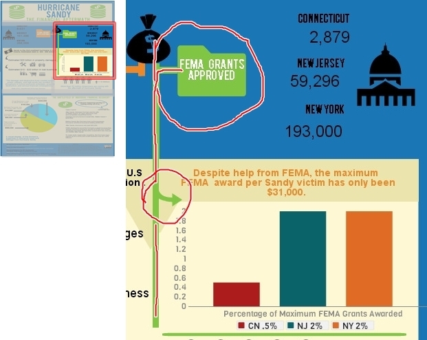
To set up a comparative framework, (as seen in the screenshot below) I contrasted the number of FEMA grant applications sent in from Connecticut, New Jersey, and New York, with the number of FEMA grants that were actually approved for those states respectively. For example, in the upper third of my infographic, I used icons to help convey different kinds of information:  the folder icon for bureaucratic process, the money bag icon for funds, and an icon that resembles our capitol building to represent state government.  Edward Tufte, (2006) contemporary author and expert on the visual display of qualitative and quantitative information, writes in Beautiful Evidence, to place labels directly on images when possible–which in turn helps to reinforce and concretize connections and causal relationships. “For showing evidence, the map metaphor suggests that labels belong on images, that external grids help scale images, and that data are more credible when contextualized” (p. 21). Likewise, I have placed the labels for “FEMA Grant Applications” and “FEMA Grants Approved” directly onto the orange and green folder icons. The names of the states and the numerical data are placed in very close proximity so that they appear as sets of information, easily distinguishable from one another.

Hurricane Sandy: The Financial Aftermath

Tufte instructs, “For explanatory presentations, important comparisons among images should usually be pointed out to viewers by means of annotations, arrows, highlighting, or other methods of directing attention” (p. 45). Therefore, to concretize connections on the page-space, I use different styles of arrows. For example, in the mid-section, the green arrow that flows off of the green line functions to connect the upper portion featuring the data about “FEMA Grants Approved” to the graph which states the exact dollar amount of the Maximum FEMA Grant ($31,000) and the percentage of people in Connecticut, New Jersey, and New York who received the Maximum FEMA Grant Award.

Hurricane Sandy: The Financial Aftermath

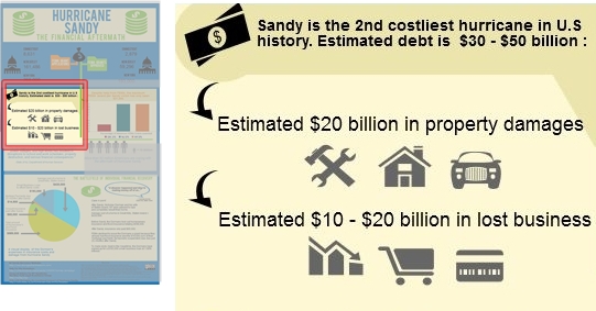
Moving over to the left-hand side of the mid-section, (see screenshot below) I use curved black arrows to connect the first statistic about Hurricane Sandy being the 2nd costliest hurricane in U.S. history to more specific financial data. First, I state that the estimated debt from the storm as being $30 – $50 billion and then just below that statistic I provide a breakdown, ($20 billion in property damages and an estimated $10 – $20 billion in lost business). The arrows are black because the icons are gray; so having a difference in color between the elements helps to break up the visual field and differentiates the arrows from the images.  Here, the arrows not only serve to visually connect the information, but they also create a sense of hierarchy by functioning as bullet points.

Hurricane Sandy: The Financial Aftermath

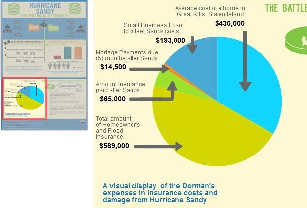
Now, when creating the pie chart to represent the financial aftermath of the storm on an individual level, I had the option to simply connect the financial data to the chart using thin lines in a minimalist style. However, Tufte would argue that, “The more generic the arrows and lines, the greater the ambiguity” (p. 68). So, in line with his ideas, I decided to create customized arrows to help ground the text and numbers to the exact place on the pie chart. Doing so helps to avoid confusion and assists the reader in being able to quickly scan the infographic and see what information is being communicated without having to closely study and dissect the graphic.

Hurricane Sandy: The Financial Aftermath

Ellen Lupton, (2010) author of Thinking With Type, writes, “A typographic hierarchy expresses the organization of content, emphasizing some elements and subordinating others” (p. 132). To create a sense of hierarchy for the bottom third of the infographic, I used the same font for the header, “The Battlefield of Individual Financial Recovery” that I used for the main title, “Hurricane Sandy, The Financial Aftermath”. I made this design choice in order to convey that the information presented is not a continuation of the mid-section, but instead a new set of information. Additionally, I added visual distinction by shading it in green. Just below the header, outlined in a blue speech bubble, is a direct quote from Nicholas Dorman, a Great Kills, Staten Island resident, which serves as a caption: “A disaster happened and they’re making money off of us.” I wanted to use a direct quote from a real person to allow the statistics and financial information a more human feel, which in turn helps the reader to better identify with the case presented.

Some readers are “primarily attracted to pictures and captions, while others prefer to follow a dominant written narrative…” (Lupton, 2010, p. 130). The caption assists in framing the range of financial facts and data in a more local scope and personal context, and it also lets the reader know at a glance specifically what the text is going to discuss. Regarding typographic design choices for pie chart label, I selected a vivid blue in a Helvetica typeface at a size 14 font, bold. These attributes allow the chart label to be easily read while appearing visually soft at the same time, so as not to be appear too heavy or overpowering.  As Lupton writes, “Scale is the size of the design elements in comparison to other elements in a layout as well as to the physical context of the work” (p. 42).

Hurricane Sandy: The Financial Aftermath

Sources

Lupton, E. (2010). Thinking with Type. New York: Princeton Architectural Press.

Tufte, E. (2006). Beautiful Evidence (3rd Edition). Cheshire: Graphics Press LLC.

Categories: infographic, information architecture, technology, tufte | Tags: , , , , , , , , , | Leave a comment

Hurricane Sandy, The Financial Aftermath: An Infographic

I have been researching Hurricane Sandy since it occurred in October of 2012 and have since created a multimodal project that presents the emotional and material aftermath of experience. However, in recent months (currently about 8 months after Sandy), storm victims are still facing extremely difficult financial realities—for many people trying to navigate the gauntlet of insurance policies and FEMA procedures has proven to be an overwhelming task, to such an extent that it has required bringing in legal help from out-of-state skilled in dealing with flood disasters. For example, many storm victims are grappling with the reality that, (unbeknownst to them) if they had insurance prior to the storm, they may be ineligible to receive money from FEMA—or very little at that. And in other cases, insurance companies are denying payment until borrowers can show proof of how the money will be spent. Recovering from the devastation of losing your home, your vehicle, nearly all of your material possessions is hard enough, let alone be denied compensation after having paid thousands in flood and homeowner’s insurance. After hearing about people having to take out loans well into the six-figure range just to float costs while trying to recover, I wanted to bring attention to the crushing circumstances Hurricane Sandy victims are still facing. My infographic highlights the hard-hitting financial reality of the storm on both a broad scale and an individual level.

My infographic, "Hurricane Sandy: The Financial Aftermath" using Piktochart technology

My infographic, “Hurricane Sandy: The Financial Aftermath” using Piktochart technology

For example, in the upper third of my infographic, to represent FEMA and grant money (grant applications and grants approved) I used an icon which resembles a government building. I placed this icon on the left and right sides. Additionally, through the affordance of color and the use of shapes to highlight and connect information, I selected green for “FEMA Grants Approved” and used green lines to further connect the folder icon in the upper third, (“Grants Approved”) to the statistics and chart in middle third, (right side) where I used a chart to highlight facts about the maximum amount of FEMA awards and the percentage of maximum ($31,000) award for New Jersey, New York, and Connecticut. Doing so assists the reader in understanding a more specific reality pertaining to storm victims trying to get help from the government after the devastation–even though thousands did receive help, the amount of help the received is like a drop in the bucket compared to the funds that are actually needed to make a difference.

In conclusion, upon analyzing my process, I was somewhat pleased with the infographic results overall, in light of the fact that this was my first time using Piktochart. However, in retrospect, I think I would have liked to have more expertise in creating charts and visual displays of data. Specifically, I would like to have been able to present the reader with a type of chart that focuses on a comparative relationship. For example, I was able to plug in the figures for the Dorman’s financial facts, (e.g., average cost of home in Great Kills, amount of their small business loan to offset debt and setbacks from the storm, the amount their insurance paid versus the amount their insurance was supposed to cover, etc.,) but I would have liked to somehow compare the funds received as relative to what they were covered for, and the average price of a house in Great Kills, (as their home was destroyed in the storm). Being able to have more control over the visual representations of data in this way would better assist me in portraying the devastating amount of financial loss that many people are currently dealing with. However, I look forward to using Piktochart more in the future and employing this mode of representation which allows my reader to make visual connections with ease and quickly understand complex information.

Categories: infographic, information architecture | Tags: , , , , , , , , , | Leave a comment

Jason’s Generative Poem

1. My generative poem was about the themes and emotions of my work-in-progress novel, “Manifestation.” The novel is very emotional and involves a lot of tragedy, pain, and death. My goal was to see how those themes translated into this new format.


I chose names of some of the novel’s characters, cities, and other important places. I also chose descriptive words that I hoped would reflect the novel’s themes, including some words I found were among the most commonly used when I did a word search of the novel. By choosing from among the most commonly used words and phrases, I hope that the poem accurately reflects which themes and emotions are the most commonly seen throughout the story.


Some of the randomly generated lines reflect the dark nature of the theme:


Energy screams

believe in the broken

run from the bleeding

Belief whispers

mourn the bleeding

A dream kills.

Belief searches for help.


Others, however, tended to come out a bit more mundane. I think part of the issue there was the lack of control over the order the words went in. If I had a greater understanding of the code (beyond making the minor tweaks I added in), I’d likely change the generator to give me a wider variety of sentence structures. For example, the poem only seems to generate three types of lines:


“Subject verbs noun,” “Subject verbs,” and “verb the adjective adjective noun.”


By contrast, the opening of another poem I wrote in the past had a more varied structure:


“I saw my own shadow today
We sat under a tree
She didn’t have that much to say
Yet still she sat by me”


I (Subject ) saw (verbed) my own shadow (my own noun) today (at certain time)
We (Subject) sat under (verbed) a tree (a noun)
She (Subject) didn’t have(didn’t verb)  that much (adverb) to say (verb)
Yet (Adverb) still (adjective) she (subject) sat (verbed)  by me (by noun)


While some of these structures could be done in the current generative poem with a little tweaking, the code wouldn’t work so well for some of them. For example, the line “She didn’t have that much to say” wouldn’t fit well in the current code structure. If I added “She” in the “above” subject field, “didn’t have” in one of the verb fields, and “that much to say” in the “below” field, I could get the sentence shown above. But when considering my other words in the poem, I could also end up with sentences like “Gabby runs that much to say,” or “Tock didn’t have the school.” Those don’t make much sense to me and I don’t feel they would fit well. Similarly, I don’t think a phrase like “Yet still” would fit well in the code structure.


Without the skill needed to alter the coding itself, I ended up feeling stuck with only the ability to choose words and phrases, not the order they came in.


2. I don’t exactly feel like the generative poem can qualify as “literature,” even based on the ideas of “cybertext” and “ergodic literature” discussed by Espen Aarseth in Cybertext: Perspectives on Ergodic Literature. In the beginning chapter, “Introduction: Ergodic literature,” Aarseth defines “cybertext” as a concept which “focuses on the mechanical organization of the text” (p. 1). A generative poem clearly qualifies, since the code that runs the poem is directly responsible for the way the text is organized on the screen. The coding itself is at least as important as, if not more important than, the choice of words used in such a poem. Without the code, the poem would have no structure, and would simply be a meaningless jumble of random words piled together. The form the code creates, even though it is randomized, is what ensures that the poem can be read and understood.


However, I don’t feel that “understandable” randomly generated lines are necessarily literary in nature. Instead, I view them as more artistic. Dictionary.com defines “art” as “the quality, production, expression, or realm, according to aesthetic principles, of what is beautiful, appealing, or of more than ordinary significance. “ A poem, even when randomly generated, can definitely have aesthetic appeal. When reading my randomly generated poem, I definitely see lines that generate emotions and reaction, and the unique combinations are definitely of “more than ordinary significance.” There is also a certain amount of skill involved in the aesthetic process of choosing words and phrases that will blend well together. A poorly chosen word bank will generate a poem without any appeal and which doesn’t provoke any emotions in the reader. Choosing words skillfully, on the other hand, can result in combinations that touch the reader and spark their curiosity and imagination.


Artistic and aesthetic appeal, however, aren’t necessarily literary in nature. It all depends on how the resulting work is interpreted. In the article “What does it mean to ‘interpret’ code?”, the author defines “interpretation” as “the systematic exploration of semiotic objects in order to explore culture and systems of meaning.” The article discusses examples such as the Coca Cola logo, based on signification. According to the article, a cultural studies scholar “does not ask what the Coca Cola Corporation intended by choosing red for the color of its cans and logo or what meaning it hi[d] in the signature-style of the words on the can. Instead, she performs a semiotic analysis on the possible meanings conveyed by those details (the color red, the cursive script) of the can in the contexts of the many surrounding sign systems and discusses what the can and, by extension the company, have come to signify” (p. 7). An example like this shows that an alphabetic text (such as a company logo) can be analyzed not merely by the importance of the words themselves, but instead based on stylistic details and metaphor.


Based on such an idea, I would examine a generative poem based on semiotic analysis of the code structure (such as what types of sentences it can generate), the on-screen display (font type and color, background, etc), and on the words in the word banks as individual objects. This is different from the way I would analyze a line in a traditional poem, where I would consider the meaning the author was trying to convey with the structure, word choice, rhythm and meter, and so on.


To show the difference in the way I would analyze a generative poem versus a traditional poem, I can examine a line from each type of poem that I have written (from the perspective of an outside reader). For example, when I wrote, “I saw my own shadow today,” I might analyze what the shadow signifies, such as whether it represents some dark secret of the writer’s past, and what “seeing” the shadow might mean with regards to the emotions evoked when being faced with those dark secrets.


When analyzing one of my lines from the generative poem, I would focus on different things. When looking at the line “believe in the broken,” I would read the line by understanding that the author separately chose the phrase “believe in” and the word “broken” without necessarily intending they would appear side by side. Therefore, I wouldn’t analyze what it means to believe in “the broken” specifically. I would instead consider the emotional impact of having words related to belief in a poem alongside negative words, such as “broken” and also “screams,” “bleeding,” and “kills.” This would give me a feeling that the author was trying to convey pain, sadness, and troubles, but perhaps with a feeling of hope remaining within.


The key difference here is between specific meaning (facing the emotions provoked by dark secrets of one’s past) and aesthetic emotional response (considering the concepts of pain and hope together). In my opinion, the former tells a story, while the latter does not. Both can generate emotion and provoke a response in the reader, as can any form of “art.” I feel that the lack of a “story” is what separates a literary poem from an artistic one.


It’s very possible that a more advanced work of coding could create a generative poem that I would feel told a story. For example, in Joyce’s (1987) “afternoon: a story” the individual pages remain static; it is only the order in which they are read which changes. This allows the author to express specific events, even though the order of events might change on subsequent readings. The difference is in the degree of control the author retains. More control is needed to tell a story of any coherence; less control shifts a work away from literary meaning and towards purely aesthetic, artistic appeal.

Categories: elit | Tags: , , , | 2 Comments

#IAMondays: Interactive Movies

Wayne recently tweeted a link to an interactive movie, which was a fascinating experience. It shared some traits that relate to the concept I wrote about on the difference between linear and nonlinear stories, but there are some key differences here.

One of the key differences between this interactive movie and another type of nonlinear story is that this one is more easily repeatable. A user types their address into the site before the movie begins, and the movie then plays with Google Earth images of the user’s own hometown and address. I can share my movie with others so that they can see how the movie plays out in my hometown. There do seem to be minor differences… after watching the movie four times, it seems like some of the camera angles are randomized. The basic scenes are the same, however, as long as I type in the same address. This can be seen as an advantage over an interactive story with many more forking paths, since those types of stories seem to be hard to repeat without remembering the specific path you took through all of the steps.

Another advantage is that the same basic “story” can be seen by anyone with their own address added in. I can type in a new address, and essentially the same movie plays, with the only real difference being a different set of Google Earth images for the new location. The other elements (the running man, the birds, the trees, and the song) remain the same for each user. I mentioned in my previous blog post that nonlinear stories make it difficult for two users to share the same experience, including their ability to discuss what the experience was like. This interactive movie, however, gives everyone a very similar experience, with just a touch of personalization.

Of course, the disadvantage is that there isn’t a LOT of customization available here. Nonlinear stories have the advantage of being able to be experienced differently each and every time. This interactive movie, while it can be personalized for each user, is very close to the same every time it is played.

The balance here seems to be in how much decision the user is given in the course of a story. In a completely linear story, the user is essentially given no choice but to move forward and experience the story as it exists. In a nonlinear story, the user has a great deal of control, and their every decision can affect the outcome of the story. The amount of control given affects how customizable a story is. This interactive movie only gives the user a small number of decisions to make, and as a result the path of the story won’t ever change very much.

I think this idea of freedom versus control is at the core of making any type of nontraditional interactive story or movie. If you give the user too much control, it can be hard to maintain any sense of continuity in a story. If you give the user too little control, the story won’t really be interactive or customizable. The amount of control you give should be carefully and deliberately decided based on what type of story (linear or non) you want to create.

Categories: #IAMondays | Tags: , , , , , | 4 Comments

Linear or Non: Which is Better?

One of our readings last week was Afternoon: A Story, by Michael Joyce. While this was in some ways a very unusual and innovative story, I don’t know if I could say it had any advantages over a more traditional storytelling method.

In a traditional story, it’s generally expected that the reader will follow a linear path, page by page, from beginning to end. This might seem limited by modern standards in the digital age, but I think there are many advantages to it. In a traditional linear story, the tale is being told in a coherent, straightforward way. There is a beginning, a sequence of events, and an ending; the same ending every time. This means that the reader, if they ever read the story again, knows what to expect. It also means that two people can both read the story and discuss it, knowing they’ve both read the same story.

“Afternoon,” on the other hand, is different every time you read it. I’ve read sections of it four separate times now, and each time I’ve had a different experience. There doesn’t seem to be anything predictable about it.

Does this nonlinearity make it better, or worse?

I can see some entertainment advantages to a nonlinear story. When I was a kid, I frequently enjoyed Choose Your Own Adventure stories, which allowed you to take the same story down a different path each time you read it. A reader is more likely to re-read such a story, knowing they can enjoy a different experience each time. Other similar nonlinear media includes certain video games, and DVDs where the movie has multiple endings.

These nonlinear stories have just as much disadvantage, however. Sometimes, a reader might WANT to experience the same story again. The more complex the divergent paths in a story become, the less likely it is that the reader can ever experience the same story again.

This would become even more pronounced in a code poem that utilized a randomizer. In that case, odds are the reader will NEVER experience the same story again.

I think one of the big differences here is the difference between storytelling and entertainment. Both qualify as “art,” but one is vastly different from the other. I don’t think “Afternoon” qualifies as a “story” in the way one is traditionally defined. It doesn’t have a clear plot or ending. While it is still entertaining, and still artistic, it doesn’t have the same effect on the reader. Is it even possible to say what it is “about”? I have a hard time, after multiple divergent readings, really understanding what was going on in the story. Many of the individual “pages” seemed so disconnected from each other that it was hard to follow what was happening from one to the next. It seems like this is the price to pay for a more “artistic” piece; it becomes more unusual and unique, but at the same time harder to really understand.

In a way I’d compare that to the ideas of abstract art. A piece of art with no defined form can be interpreted differently by each person who views it. A more defined piece of art, however, simply is what is is (setting aside deeper analysis of symbolism and metaphor within a work).

I don’t know if it’s fair to say either a linear or nonlinear story is “better” or “worse.” However, it definitely has disadvantages that make it more complex and harder to understand.

Categories: information architecture | Tags: , , , , , , , | 5 Comments

It’s time to transform with creative thinking

You’re currently reading words that are floating around on cyberspace. You’re not viewed as a reader, but as Aerseth writes, you are on your own adventure, taking risks. So, while we’re taking risks and exploring, Nelson mentions that most of us don’t actually understand the computer.  At first I thought that this meant we don’t understand how computers work, or even, how to operate computers and I expected to read something like a computer manual. Don’t get me wrong, Computer Lib / Dream Machine is certainly a manual of some type, but not the traditional manual.

Everything we’ve been reading and learning about recently has been quite the opposite of the traditional things we’re used to. I even though about writing this blog post in a different way, against the grain, but I had no idea where to even start; we must take baby steps. As Nelson argues, we learn most things by beginning with “vague impressions” (p. 303).  The first step in understanding the computer is to learn that it is a media that provokes emotions and helps us write, think, and show (Nelson, p. 306).

Now, the key word is help. It’s not the writer itself, nor it solely just the delivery method. For example, in Taroka Gorge (and the others too), a real human being came up with the basic structure: the main idea and the words. The computer put together the form and structure: how the words appeared to the audience. In the poems we read, there’s a feedback loop that keeps using the same words and creating different outcomes. I’m going to attempt to do so myself, but I have a hunch it’s much easier when a computer does it.

Roscoe retaliates to grab my banana whole heartedly.

My banana retaliates.

Roscoe grabs.

My whole banana.

My heartedly banana grabs Roscoe.

I think you get the point. Something that took me a few minutes to do would take a computer seconds to do. So in essence, it can be argued that computers essentially think for us, but not without the correct input.

But how do we learn what the correct input is? Well, as Nelson shows from the article,  “No more teachers’ dirty looks”, it’s beginning next to impossible to teach. Schools are focusing so much on standardized this and standardized that, that creativity is thrown out the window. Surely this is displayed in any type of creative situation, but especially in computers. How can the youth of the future learn how to be creative when computer classes are tailored to very specific tasks and are very standardized?  Furthermore, it can be said that the education system is behind in change. Literature teachers are teaching poems from a long history ago, yet they seem to glide over the current period of poems: e-lit at its finest.

Last week, we struggled, or at least I struggled, to understand the electronic literature we were required to read. We learned that it was difficult for us to tailor our traditional style of reading because it was all that we had known. If schools spend time teaching electronic literature, alongside traditional literature, students would become accustomed and be better able to code switch from one to the other.  As Nelson argues, “students should develop through practice, abilities to think,  argue, and disagree intelligently (p. 310).  But instead of this, students spend countless hours learning about topics that bore them to tears. One that I can recall, from both high school and community college, is the basic computer class that teaches you how to use Microsoft programs. Why is that a real class? And even more, it strictly taught and tailored the projects we would do. The whole class had to create an excel spread sheet from the same baseball statistics. How boring and inconclusive. And even more, these classes started the rave for PowerPoint, and we all know how Tufte feels about PowerPoint (which I think goes for all of us as well). I think it’s time the school systems caught up to the technology that is vastly developing.

The question about all of this, which Nelson asked as well ,is how will we use these creations? (p. 117). This is something that could truly be in our hands, yet it might also slip away if not treated carefully. School systems, and society, need to recognize these new ways of writing and creative thinking as a real possibility, and they need to begin to educate on them.  The time for transformation is now.

Categories: class activities, images, information architecture, mapping, semantic web, technology, Uncategorized | Tags: , , , , , | 4 Comments

Final Infographic and Reflections

InfographicFinal


Reflection 1

The goal of my infographic was to raise awareness about animal mills while also trying to convince people to adopt. I think people still see pet adoption as a less-than-ideal way to get a pet, because pets that are up for adoption are “second-hand.” I wanted people to see how adopting pets can help decrease the abuse animal mills perpetuate, and I wanted people to see that adopting does not mean you will be getting a “bad” animal. I think my use of icons and bright colors helps people clearly see my point. I wanted to use simplistic design to make my message the main focus, rather than complex design. The flow of my infographic shows how popular different pets are in the US, followed by statistics on animal mills. This may seem like an odd comparison, but I want it to point to the fact that many people who own animals unknowingly get them from animal mills. By following this up with details about animal shelters I wanted to show that they are a better alternative to pet stores and direct animal mill purchasing, because many animals die in shelters regardless of their good temperament and clean bill of health. In the end I reaffirm that there are multiple species of animals available for adoption, and I conclude with ADOPT written in large, bright pink lettering. I think I make it clear that adoption is a much better alternative to pet-store purchasing. I wanted to include more information about the pros of adopting, but with limited space and time I found it difficult. Piktochart is also not very user-friendly, so I found it hard to rearrange things, which I would have had to do if I were to add more information. I had a hard time trying to place objects without them jumping around from block to block, and I did not like that I couldn’t have images and text spread between two different blocks. I think it made creating the infographic more linear rather than free form. Surprisingly, I think I actually needed more physical room for my infographic. I would like to add a space that tells more about the availability of animals in shelters, including statistics about the health and breeding and species types of animals. I tried to cram some of that information in at the bottom of the infographic, but I think it would have been better if it were written out.

Reflection 2

I attempted to base my design largely on Tufte’s ideas. At first, I think I got caught up with Tufte’s “chart junk,” because I wanted to show my statistics with actual graphs. I was wrapped up in the preset layout which included charts–at first it seemed “prettier” and easier to understand. When I asked about it and reconsidered the best way to represent my stats, I came to realize it is much more effective and visually appealing to use icons as a visual representation of statistics. In my section about euthanasia in animal shelters, I chose to use cat and dog icons coupled with needles to represent the percentages of animals euthanized. This way, the graphic would not be filled with actual graphs, but visuals that showed the same information. I accompanied these visuals with a small amount of text, the minimal amount of text necessary to get the information across. My goal was to keep it clutter-free and straight forward. I also tried to group the information together, so that everything related could be seen in the same area, rather than forcing viewers to look all over and lose their trains of thought. Tufte believes both of these design choices are important to get information to viewers in the most effective way. Throughout my design I tried to make sure my visual enhanced and informed the alphabetic text, including the pink, red, green, and blue banners on the top section of my infographic. The statistics on animal ownership are accompanied by banners that visually represent the amount of animals owned in millions–meaning the largest banner is both first, and represents cats, which are the most owned in the US. I wanted all of my information to be backed up by visuals throughout, even in subtle ways. I included some arrows to help lead viewers’ eyes to related information as well, which Tufte uses in his own writing. For example, in my section about mill animals, I use an arrow to symbolize smoke coming from the factory. The arrow grows out of the top of the factory and leads the eyes to an explanation of animal mills. I wanted to arrow to serve two purposes. I also chose to use colors that were bright and eye catching. I did this for two reasons–first, because I wanted my infographic to grab the attention of virtual passersby, and second, because I wanted the bright colors to contrast with the information. Of course, bright colors are associated with exciting and happy things, but the information I am presenting is largely not. The contrast should be a bit shocking. Interestingly, the end message that convinces people to adopt does promote happiness and positive endings like the bright colors suggest.


Deciding which typeface to use for my infographic was tough. Like the color choice, I wanted the typeface to be inoffensive and calm. Fortunately, the default theme type included a sans serif header typeface that was long and smooth. I picked this because it was easy to read and didn’t really evoke much feeling. I especially liked it for the bottom “ADOPT” section because the typeface is very clean, no nonsense, and makes the message all the more straight-forward. For the main body text I chose a serif typeface that was equally clean, but a little more fun. I think the rounded, thick bowls seem remniscent of Comic Sans (yikes), but in a more sophisticated way. Again, I wanted the main body to be unobtrusive, contrasting the real message. The most important typefaces choice, to me, is my use of Courier New for my “hard hitting” statistics and facts. I chose Courier New because it is well known. CN is also associated with typewriter-like typefaces. I think using CN worked because typewriters are commonly associated with data, and much of the information I presented in this typeface was data driven. I also wanted it to stand out from the other more simplistic types. Unlike the other two, CN is thin and has tight leading. It stands out and because it is recognizable, it catches your eye.


Overall, I tried to make conscious decisions to follow the principles laid out by Lupton and Tufte. I think, for the most part, the choices I made based on their design ideas has enhanced the way I presented the information in my infographic.

Categories: infographic | Tags: , , , , , , , , , , , | Leave a comment

Publication Infographic Final

Infographic 3

Reflection 1:

My inspiration for this infographic was based on my recent research into the field of publication. I’ve found that there is a lot of confusing information out there, and most people I’ve spoken to don’t seem to understand all of the same ideas. For example, I have some writer friends on Twitter who are very excited about self-publication, but who don’t really know how it works or how much money they can expect to make. I thought it might be useful for them to have something that showed the important information all in one place.

Since the questions many writers face with publication usually involve decisions between one path or another, I decided a comparison of the various types of publication would be the most useful. From the beginning I planned to have a variety of three-way comparisons that would clearly lay out some of the major differences. This way people can see clearly what their options are, and make easy visual judgments about what is the most common, popular, or useful to them. A lot of the information I found normally didn’t make the comparisons as clear; the numbers were usually spread out in separate paragraphs without any direct explanation to link one number to another. This created some confusion, such as the articles I read making it hard to tell when they were referring to overall publication statistics, print books, or ebooks. Some of the numbers were left out of those articles entirely, and I had to extrapolate them (for example, the 6% of books being independently published weren’t mentioned at all, and I had to figure out that number after subtracting the self and traditional publication numbers).

One of the biggest limitations I found was that piktochart didn’t seem to have any good options for helping me align the various icons and background shapes I used. I had to eyeball a lot of things, and I feel like under close examination there will be visual flaws in the layout. I would have preferred if the program had a tool similar to Prezi’s that showed me when two objects were the same size, centered correctly, or aligned on the same horizontal or vertical point as each other.

I also felt I generally lacked enough artistic skill to make the layout visually appealing. I had to judge color choices and shapes simply by what I thought looked good. If I were to make an infographic in a professional environment, I would probably want to work together with someone with more artistic skills, collaborating on the design but letting the other person make the graphical choices while I did the writing. Either that, or practice enough myself to attain a higher level of skill than what I had here.

Reflection 2:

I laid out the text of the infographic with two types of hierarchy in mind. One was a change in color, which Lupton suggests can be uses for emphasis (p. 132) instead of italic or bold font. I decided that the headings for each grid would stand out well in color, compared to the plain white font I used for most of the text. Since I was laying out the text in a nonlinear fashion, I thought this emphasis would be a good way to draw the reader’s attention to each heading first. If I had been writing a normal paper where everything was linear and the reader followed the text from the top to the bottom, headings could have simply been placed between paragraphs, possibly in a larger font size. The layout of the infographic, however, meant that sometimes the headings were either above, below, or to the side of the information they related to. I felt this meant they needed to stand out in some way.

A second hierarchical method I used was simply changing the font size. The headings for each grid are in the largest size, the sub-headings (such as for self, indie, and traditional publication) are in a smaller size, and the main blocks of informative text are in the smallest. I wanted to avoid excessively fancy font choices, since they would have been unnecessary and distracting. Likewise, I avoided adding too much fancy imagery in the text frames, and stuck with simple colored blocks as backgrounds. I felt that either fancy font or excessive imagery would be what Tufte calls “chartjunk” (p. 152). Even some of the basic icons picktochart provides seemed like they would be content-free distractions and pointless decoration, which Tufte disapproves of. I therefore kept my use of icons to a minimum.

I tried to use a consistent color scheme throughout the infographic, in order to avoid distraction and unnecessary decoration. Even though I was already using simple colored blocks, I felt that too much color would make the infographic harder to read and ruin the continuity of design. Even when choosing my initial template, I avoided ones that seemed too “busy.” Pointless color and cartoonish design would have gone against Tufte’s suggestions that a design should be clear and efficient (p. 79).

I also attempted to make visual comparisons easy to see as a supplement to the numerical information being shown. Tufte suggested that information always needs to be compared with something specific and appropriate (p. 127). He also discusses how a good graphic should visually show the ratio between different statistics, with text included right alongside the graphics. Piktochart didn’t really allow me to make precise measurements, so I settled for rough size differences in the backgrounds on the ebook publication comparisons, with the 87,000 total ebooks in the largest box, and the 12,000 that were independently published in the smallest box. I then supplemented this with icons that give a quick visual comparison (1 book icon = 10000 sales).

The sections of the infographic were laid out to keep related information close to each other. I wanted to make sure that when the reader looks at the infographic, they can easily tell which information is related and should be considered together. Tufte suggests keeping relevant material within the common visual field (p. 91) in order to keep them unified. I kept this in mind when laying out each grid, so that all the information on print books is together in one place, ebooks in another place, distribution of money in another, and so on. Also, even though most of the grids have a three-way comparison between different pieces of information, I made sure to use a slightly different design on each. The first is triangles, the second rectangles, the third parallelograms, etc. This keeps each grid self-contained as its own block of information, with the intent of guiding the reader to view each grid as if it were a separate “page.”

All together my approach was to use simple design, with the goal of keeping the infographic plain while remaining visually appealing. The focus was on the content, not on artistic design for the sake of artistic design.

References:

Lupton, E. (2010). Type (2nd Expanded ed.). New York, NY: Princeton Architectural Press.

Tufte, E. (2006). Beautiful evidence (3rd ed.). Cheshire, CT: Author.

Categories: infographic | Tags: , , , | Leave a comment

Information Architecture and Computer Technology

“The summation of human experience is being expanded at a prodigious rate, and the means we use for threading through the consequent maze to the momentarily important item is the same as was used in the days of square-rigged ships.”

These words, written by Vannevar Bush in “As We May Think,“ echo a similar sentiment I have when I see my parents searching for a phone number through a phone book. It’s 2013, and there’s no reason to flip through an archaic volume of phone numbers. We have computers now.

Only Bush wasn’t writing in 2013. He was writing in 1945, before anyone had any conception of electronic databases. But, still, he recognized the need for one. So, he proposes a device he calls “memex,” which looks similar to a modern-day computer. It has monitors, a keyboard and tape that files images and information. The ability to store the sheer volume of information available wasn’t the crux of the memex. Bush imagined a machine that could be used for “associative indexing” — connecting multiple separate texts together to create a more efficient way of retrieving information.

But what do computers have to do with information architecture? Perhaps, in 2013, we take the idea of instantly locating our desired queries for granted. But in the mid-20th century, the world had to scour through pages of books to find what they were looking for. The only sequence of information available was the one that the book allowed. With a memex, a user could create their own sequence of information, thus conceptualizing information in new ways.

The only problem was, the technology just wasn’t available at the time. Think of all the problems we face today with technology and all the solutions we’ve conceived but yet to master. Take, for example, cell phone battery life. How can we prevent cell phone batteries from draining when we’re on the go? Can we make a screen that converts sunlight to energy? Can we create wireless chargers? Or can we make a perpetual battery? The inventors of the first electronic computers faced similar hurdles.

But, as time progressed, we get innovations like the hyperlink, folders and the World Wide Web. In Douglas Engelbart’s “Augmenting Human Intellect,” he describes how human thinking is limited in the way it is presented to us in books. The human thought process is “sequential but not serial,” meaning it is like a map linking ideas together, but not necessarily in a linear fashion. Thoughts are related, but perhaps not in a hierarchy. He advocates for computers like the memex, in which we can reorient ideas around a space so we can “trim, extend, insert and rearrange so freely and rapidly.”

All of these ideas continue to build on one another. Theodor H. Nelson’s 1965 “A File Structure for the Complex, the Changing and the Indeterminate,” he draws up early images of word processors in saving multiple variations of the same text on a computer, which he dubs “dynamic outlining.” He also introduces the word hypertext, and he uses it in the same way we use it today: typed words that lead to another work when engaged by the user, be it another article or a definition or annotation. He hoped to use it to “integrate, for human understanding, bodies of material so diversely connected that they could not be untangled by the unaided mind.”

Flash forward to the 21st century, and computers become more affordable, Internet use more widespread. With so many people adopting computers and becoming computer literate, communities begin to develop their own forms of searching, labeling and collecting information. Adam Mathes calls these new terms “folksonomies.” He uses tags on Flickr and Delicious as his primary examples. He states that tags are more about “categorization” than “classification,” suggesting users make connections between tags based on broad generalities and less on distinctions. Though he notes an advantage to using tags in this manner provides users with a low barrier to entry in sharing information space, he observes a quirk in tag culture. The blanketing tags make browsing through concepts and ideas simple enough, but finding specific data proves much more difficult. Where are we heading in the future? How much accuracy in sorting through information do we sacrifice for expediency? Which is more important?


Categories: Uncategorized | Tags: , , , , | 3 Comments

Blog at WordPress.com.