“Hurricane Sandy: The Financial Aftermath” infographic presents financial data, statistics, and a personal account in one space, and it examines the financial plight of storm victims in light of the financial assistance they have received through FEMA and insurance policies, compared to the financial loss suffered.
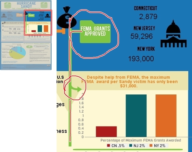
To set up a comparative framework, (as seen in the screenshot below) I contrasted the number of FEMA grant applications sent in from Connecticut, New Jersey, and New York, with the number of FEMA grants that were actually approved for those states respectively. For example, in the upper third of my infographic, I used icons to help convey different kinds of information: the folder icon for bureaucratic process, the money bag icon for funds, and an icon that resembles our capitol building to represent state government. Edward Tufte, (2006) contemporary author and expert on the visual display of qualitative and quantitative information, writes in Beautiful Evidence, to place labels directly on images when possible–which in turn helps to reinforce and concretize connections and causal relationships. “For showing evidence, the map metaphor suggests that labels belong on images, that external grids help scale images, and that data are more credible when contextualized” (p. 21). Likewise, I have placed the labels for “FEMA Grant Applications” and “FEMA Grants Approved” directly onto the orange and green folder icons. The names of the states and the numerical data are placed in very close proximity so that they appear as sets of information, easily distinguishable from one another.
Tufte instructs, “For explanatory presentations, important comparisons among images should usually be pointed out to viewers by means of annotations, arrows, highlighting, or other methods of directing attention” (p. 45). Therefore, to concretize connections on the page-space, I use different styles of arrows. For example, in the mid-section, the green arrow that flows off of the green line functions to connect the upper portion featuring the data about “FEMA Grants Approved” to the graph which states the exact dollar amount of the Maximum FEMA Grant ($31,000) and the percentage of people in Connecticut, New Jersey, and New York who received the Maximum FEMA Grant Award.
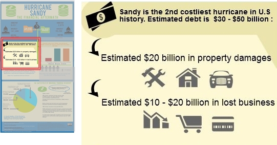
Moving over to the left-hand side of the mid-section, (see screenshot below) I use curved black arrows to connect the first statistic about Hurricane Sandy being the 2nd costliest hurricane in U.S. history to more specific financial data. First, I state that the estimated debt from the storm as being $30 – $50 billion and then just below that statistic I provide a breakdown, ($20 billion in property damages and an estimated $10 – $20 billion in lost business). The arrows are black because the icons are gray; so having a difference in color between the elements helps to break up the visual field and differentiates the arrows from the images. Here, the arrows not only serve to visually connect the information, but they also create a sense of hierarchy by functioning as bullet points.
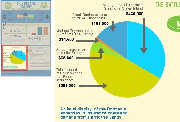
Now, when creating the pie chart to represent the financial aftermath of the storm on an individual level, I had the option to simply connect the financial data to the chart using thin lines in a minimalist style. However, Tufte would argue that, “The more generic the arrows and lines, the greater the ambiguity” (p. 68). So, in line with his ideas, I decided to create customized arrows to help ground the text and numbers to the exact place on the pie chart. Doing so helps to avoid confusion and assists the reader in being able to quickly scan the infographic and see what information is being communicated without having to closely study and dissect the graphic.
Ellen Lupton, (2010) author of Thinking With Type, writes, “A typographic hierarchy expresses the organization of content, emphasizing some elements and subordinating others” (p. 132). To create a sense of hierarchy for the bottom third of the infographic, I used the same font for the header, “The Battlefield of Individual Financial Recovery” that I used for the main title, “Hurricane Sandy, The Financial Aftermath”. I made this design choice in order to convey that the information presented is not a continuation of the mid-section, but instead a new set of information. Additionally, I added visual distinction by shading it in green. Just below the header, outlined in a blue speech bubble, is a direct quote from Nicholas Dorman, a Great Kills, Staten Island resident, which serves as a caption: “A disaster happened and they’re making money off of us.” I wanted to use a direct quote from a real person to allow the statistics and financial information a more human feel, which in turn helps the reader to better identify with the case presented.
Some readers are “primarily attracted to pictures and captions, while others prefer to follow a dominant written narrative…” (Lupton, 2010, p. 130). The caption assists in framing the range of financial facts and data in a more local scope and personal context, and it also lets the reader know at a glance specifically what the text is going to discuss. Regarding typographic design choices for pie chart label, I selected a vivid blue in a Helvetica typeface at a size 14 font, bold. These attributes allow the chart label to be easily read while appearing visually soft at the same time, so as not to be appear too heavy or overpowering. As Lupton writes, “Scale is the size of the design elements in comparison to other elements in a layout as well as to the physical context of the work” (p. 42).
Sources
Lupton, E. (2010). Thinking with Type. New York: Princeton Architectural Press.
Tufte, E. (2006). Beautiful Evidence (3rd Edition). Cheshire: Graphics Press LLC.


