Treaty of Greens: Generate this! (Reflections)

Treaty of Greens (generative poem)

Reflection 1

As a person who isn’t that into traditional poetry, I was less than enthused with an assignment that was labeled as “generative poetry.” In traditional poetry, I typically pick a specific subject or mood and run with that, so I did the same approach with this assignment. At the beginning of this assignment, I was in the process of writing a theorized letter to my CEO (at Walgreens), where I argued the lack of love for cashiers. I was feeling pretty passionate about my job, so that’s how I stumbled upon Walgreens as my subject matter. I planned on creating a poem that showed the virtues and triumphs of cashiers, until I had a terrible day at work. My goal evolved into showing the “dark side” of Walgreens.

The word choice part was pretty easy, at least in comparison to traditional poetry. I decided to have one group of words that portrayed more to my job title, and another category of words that portrayed to the customer. I decided to capitalize words that would show anger or aggression, or other words that could relate to such a subject. For example, I capitalized ASSHOLES because that’s typically something cashiers scream in their head at rude customers. In a different light, I capitalized PATIENCE because it’s something most customers seem to lack. I think by capitalizing certain words this emphasizes certain points in the poem, which seems to add a nice touch. Furthermore, this creates contrast. The verbs were a little bit more difficult to come up with, for some reason I cannot explain. I think part of it is because I was trying too hard to think of unique verbs. I felt that most of the verbs I managed to scrounge up were rather boring and didn’t paint a picture, but I wanted the verbs to relate to Walgreens. I did manage to get a few odd verbs in there as “engulf”, “defecates”, and “delegate”. These are still loosely tied to the job of a cashier, especially at my store, and I think it really puts a twist on the generative poem.

As mentioned previously, I wasn’t crazy about traditional poetry before this, so I wasn’t too excited for this assignment. While I didn’t love this assignment, I did enjoy that I could essentially have a computer create a poem for me, only each time it would magnificently different than the previous time. This poem definitely challenged me to rethink how poetry is composed in general. By creating poetry in this way, through code, it really changed what poetry can be. It helped me see that poetry, whether through code or traditional, follows some type of pattern with words. However, the generative poetry really expands poetry. Instead of having a traditional sentence, that most people would write, generative poetry can create these crazy, enlightening sentences that one would never think of creating. It’s this aspect that has challenged me to really rethink poetry; maybe I didn’t like traditional poetry because of all of the constraints and limitations. This generative poem has helped me see that anything can be poetry; I don’t need to conform to certain poetry idealism’s in order to create a great poem. Furthermore, this assignment has helped me to start to consider that code itself is poetry; it follows a certain pattern, adheres to certain rules, and creates meaning in something.

Reflection 2:

There are many people in society today who don’t believe that this very assignment on generative poetry is not a true form of literature; we could even argue that there is one of those nonbelievers among our graduate course (cough Jason cough). It’s understandable for most readers to first assume that generative poetry is unlike traditional poetry and literature in general, but after studying it and learning the essence behind codes, it can be argued that there really is no difference at all.

In Perspectives on Ergodic Literature Espen Aarseth (1997) argues that cyber text focuses on the “mechanical organization of the text, by posting the intricacies of the medium as an integral part of the literary exchange,” (p. 1). In simpler terms, the computer is not just the medium, it’s part of the text too.  Aarseth further argues that cyber text is no different from other texts because all literature is different for every reader, the reader has to make choices in order to make sense of the text, and a text can only be read in one sequence at a time (p. 2) All three of these standards apply to both the generative poem assignment, as well as traditional poetry or literature in general.

Generative poetry and electronic literature challenges traditional text, but that doesn’t mean that the newly invented literatures don’t qualify as literature. Aarseth writes that “text is something more than just marks upon a surface,” (p. 12), meaning that text is something that creates meaning and allows for the flow and exchange of ideas. In The Semantic Web Revisited, Nigel Shadbolt, Wendy Hall, and Tim Berners-Lee (2006) claim that the Web consists of “documents for humans to read to one that included data and information for computers to manipulate,” (p. 96).  Even if computers are manipulating the text, much like in the generative poem, meaning is still being made by the reader, or even, humans. And then, the same argument occurs: there is a difference between paper and computer texts. But what is the difference? Aarseth argues that “the real difference between paper texts and computer texts is not very clear,” (p. 10) and it is true; other than the medium, what is the difference?  There are obvious subtle differences, like computers run on electric and the words are coded to appear on a screen, but the argument is that this code is literature too. How? Code uses a certain language and follows a pattern in order to create something meaningful to the reader. Codes can change the color of a text or background, among millions of other things. In comparison, the human hand and mind can write poetry with a certain rhythm that displays different emotions. The medium is still literature.

Since we can consider generative poetry as a type of literature with the evidence presented, we must consider what this means for the composition and structure. Aarseth writes that cyber text “centers attention on the consumer, or the user, of the text,” (p. 1), which changes the way that we compose. Instead of composing a poem for a traditional reader, we must begin to consider other options. For example, readers can be users or even co-authors. We must write in such a way that can account for that; the text must be more interactive to allow for the co-authorship. However, this poses a bit of a threat for the “reader”. Aarseth argues that the cyber text reader “is not safe” which means we can argue that “they are not a reader,” (p. 3). Most books are predictable and allow for full control, but with these newly developed ways of writing, more risks are available for the reader. The reader can fail at understanding how to navigate through the text which leads to a lack of understanding.

Understanding then, is linked to interpretation. But not interpretation as we know it. In “What does it mean to ‘interpret’ code,” a blogger writes that interpretation is no longer what it used to be; it’s not that “search for what the author secretly meant,” but rather it is the exploration of “semiotic objects in order to explore culture and systems of meaning.” This definition changes how we view literature; it’s not about that problem or climax, it’s about the meaning behind the text, and the interaction the text has with the medium to create that meaning. Just as words work together on a page to create a narrative, or within a Haiku to show imagery and emotion, words work behind the screens of a screen with code and the computer to create meaning.

Resources:

Aarseth, E. (1997). Introduction: Ergodic literature. In Cybertext: Perspectives on Ergodic            Literature. Baltimore, MD: Johns Hopkins University Press. Retrieved from            http://cv.uoc.edu/~04_999_01_u07/aarseth1.html.

Berners-Lee, T., Hall, W., Shadbolt, N., (2006). The semantic web revisited.

What does it mean to ‘interpret’ code? (n.d.) Critical Cod Studies.
Categories: Alphabetic Text Analysis, class activities, elit, ergodic literature, evidence, generative poem, images, information architecture, mapping, semantic web, technology | Tags: , , , , , , , , , | Leave a comment

Jason’s Generative Poem

1. My generative poem was about the themes and emotions of my work-in-progress novel, “Manifestation.” The novel is very emotional and involves a lot of tragedy, pain, and death. My goal was to see how those themes translated into this new format.


I chose names of some of the novel’s characters, cities, and other important places. I also chose descriptive words that I hoped would reflect the novel’s themes, including some words I found were among the most commonly used when I did a word search of the novel. By choosing from among the most commonly used words and phrases, I hope that the poem accurately reflects which themes and emotions are the most commonly seen throughout the story.


Some of the randomly generated lines reflect the dark nature of the theme:


Energy screams

believe in the broken

run from the bleeding

Belief whispers

mourn the bleeding

A dream kills.

Belief searches for help.


Others, however, tended to come out a bit more mundane. I think part of the issue there was the lack of control over the order the words went in. If I had a greater understanding of the code (beyond making the minor tweaks I added in), I’d likely change the generator to give me a wider variety of sentence structures. For example, the poem only seems to generate three types of lines:


“Subject verbs noun,” “Subject verbs,” and “verb the adjective adjective noun.”


By contrast, the opening of another poem I wrote in the past had a more varied structure:


“I saw my own shadow today
We sat under a tree
She didn’t have that much to say
Yet still she sat by me”


I (Subject ) saw (verbed) my own shadow (my own noun) today (at certain time)
We (Subject) sat under (verbed) a tree (a noun)
She (Subject) didn’t have(didn’t verb)  that much (adverb) to say (verb)
Yet (Adverb) still (adjective) she (subject) sat (verbed)  by me (by noun)


While some of these structures could be done in the current generative poem with a little tweaking, the code wouldn’t work so well for some of them. For example, the line “She didn’t have that much to say” wouldn’t fit well in the current code structure. If I added “She” in the “above” subject field, “didn’t have” in one of the verb fields, and “that much to say” in the “below” field, I could get the sentence shown above. But when considering my other words in the poem, I could also end up with sentences like “Gabby runs that much to say,” or “Tock didn’t have the school.” Those don’t make much sense to me and I don’t feel they would fit well. Similarly, I don’t think a phrase like “Yet still” would fit well in the code structure.


Without the skill needed to alter the coding itself, I ended up feeling stuck with only the ability to choose words and phrases, not the order they came in.


2. I don’t exactly feel like the generative poem can qualify as “literature,” even based on the ideas of “cybertext” and “ergodic literature” discussed by Espen Aarseth in Cybertext: Perspectives on Ergodic Literature. In the beginning chapter, “Introduction: Ergodic literature,” Aarseth defines “cybertext” as a concept which “focuses on the mechanical organization of the text” (p. 1). A generative poem clearly qualifies, since the code that runs the poem is directly responsible for the way the text is organized on the screen. The coding itself is at least as important as, if not more important than, the choice of words used in such a poem. Without the code, the poem would have no structure, and would simply be a meaningless jumble of random words piled together. The form the code creates, even though it is randomized, is what ensures that the poem can be read and understood.


However, I don’t feel that “understandable” randomly generated lines are necessarily literary in nature. Instead, I view them as more artistic. Dictionary.com defines “art” as “the quality, production, expression, or realm, according to aesthetic principles, of what is beautiful, appealing, or of more than ordinary significance. “ A poem, even when randomly generated, can definitely have aesthetic appeal. When reading my randomly generated poem, I definitely see lines that generate emotions and reaction, and the unique combinations are definitely of “more than ordinary significance.” There is also a certain amount of skill involved in the aesthetic process of choosing words and phrases that will blend well together. A poorly chosen word bank will generate a poem without any appeal and which doesn’t provoke any emotions in the reader. Choosing words skillfully, on the other hand, can result in combinations that touch the reader and spark their curiosity and imagination.


Artistic and aesthetic appeal, however, aren’t necessarily literary in nature. It all depends on how the resulting work is interpreted. In the article “What does it mean to ‘interpret’ code?”, the author defines “interpretation” as “the systematic exploration of semiotic objects in order to explore culture and systems of meaning.” The article discusses examples such as the Coca Cola logo, based on signification. According to the article, a cultural studies scholar “does not ask what the Coca Cola Corporation intended by choosing red for the color of its cans and logo or what meaning it hi[d] in the signature-style of the words on the can. Instead, she performs a semiotic analysis on the possible meanings conveyed by those details (the color red, the cursive script) of the can in the contexts of the many surrounding sign systems and discusses what the can and, by extension the company, have come to signify” (p. 7). An example like this shows that an alphabetic text (such as a company logo) can be analyzed not merely by the importance of the words themselves, but instead based on stylistic details and metaphor.


Based on such an idea, I would examine a generative poem based on semiotic analysis of the code structure (such as what types of sentences it can generate), the on-screen display (font type and color, background, etc), and on the words in the word banks as individual objects. This is different from the way I would analyze a line in a traditional poem, where I would consider the meaning the author was trying to convey with the structure, word choice, rhythm and meter, and so on.


To show the difference in the way I would analyze a generative poem versus a traditional poem, I can examine a line from each type of poem that I have written (from the perspective of an outside reader). For example, when I wrote, “I saw my own shadow today,” I might analyze what the shadow signifies, such as whether it represents some dark secret of the writer’s past, and what “seeing” the shadow might mean with regards to the emotions evoked when being faced with those dark secrets.


When analyzing one of my lines from the generative poem, I would focus on different things. When looking at the line “believe in the broken,” I would read the line by understanding that the author separately chose the phrase “believe in” and the word “broken” without necessarily intending they would appear side by side. Therefore, I wouldn’t analyze what it means to believe in “the broken” specifically. I would instead consider the emotional impact of having words related to belief in a poem alongside negative words, such as “broken” and also “screams,” “bleeding,” and “kills.” This would give me a feeling that the author was trying to convey pain, sadness, and troubles, but perhaps with a feeling of hope remaining within.


The key difference here is between specific meaning (facing the emotions provoked by dark secrets of one’s past) and aesthetic emotional response (considering the concepts of pain and hope together). In my opinion, the former tells a story, while the latter does not. Both can generate emotion and provoke a response in the reader, as can any form of “art.” I feel that the lack of a “story” is what separates a literary poem from an artistic one.


It’s very possible that a more advanced work of coding could create a generative poem that I would feel told a story. For example, in Joyce’s (1987) “afternoon: a story” the individual pages remain static; it is only the order in which they are read which changes. This allows the author to express specific events, even though the order of events might change on subsequent readings. The difference is in the degree of control the author retains. More control is needed to tell a story of any coherence; less control shifts a work away from literary meaning and towards purely aesthetic, artistic appeal.

Categories: elit | Tags: , , , | 2 Comments

Generative Poem Reflection 1

I really enjoyed this kind of approach to writing. After finding my topic, ( the poem is based off a weird dream I had, which stood out more because I don’t dream) After getting the title/topic-Tlaloc, an Aztec deity, and all sorts of apocalyptic  imagery, I had began my word choices. Before this, though, I looked at the html set-up of Tacoma Grunge. I noticed beyond organizing words by  nouns, adjective, etc, the poet also selects words that will build environment.

This is something I tried to copy, and it’s something I think is a key difference in writing generative poetry. I can estimate, using the code, where and in what circumstances my words will appear, but cannot really say what lines will appear. So what I tried to do, what I thought I saw Chuck Ryback, author of Tacoma Grunge doing, was to construct a wordbank that all related to the topic at some level.

I did some research about Tlaloc, trying to find ideas or things associated with him that I could use in my poem. Since my dream had a very doom-y perspective, I tried to build this mood in my verb and adjective choices, deliberately choosing harsh sounding words and words that have a negative connotation. Unhappy stuff, lots of death.

In all honesty, I think I went a little too far afield. I think my poem could be a little more focused on Tlaloc and aspects of him-more water related stuff, more Aztecian mythology in general, Tlaloc celebrations. I bring in other mythologies-Christian, Nordic, North American Native American, Islamic, as well as various New Age mysticism and fringe cults and what have you. While I think they were interesting, I think I could have limited my focus-I feel the poem is less about Tlaloc than it could have been, and with a little more research I can come up with a lot more great Aztec/Tlaloc specific stuff.

Making verb selections was interesting. I would pick a word, and then that word would make me think of three others. This was helpful in fleshing out the poem, and making sure that lines/phrases/words didn’t repeat themselves too much, which made everything look new, but it also made me question if I was writing, or simply playing word association. I was trying to associate words with the topic, and I feel the paranoiac atmosphere I was going for gave me some leeway, but I am still not completely satisfied. I’m also split between this being unhappy with the way the words kind of took off in a million directions, away from Tlaloc-centric stuff, or unhappy because I was projecting a different kind of expectations to the writing.

In the first attempt, I was much more interested in getting the words up there than anything else. For the final poem, I tried to be a little more cognizant of my placement. To this end, I made an alteration to the html code,  constructing a variable of just god-names. I also changed some code to fix the s (the letter just seemed to crop up, which lead to odd spelling). These are small changes but I think they improved how my poem looks and reads.

I’m totally enamored with the project. I really like seeing how lines are constructed just from a database I set up and kept tweeting lines because I was really pleased with some. There were lines I would have never thought of writing, and it just keeps going.  Poetry to me is all about creating lines that convey extraordinary meaning, and I think that generative poetry is an extremely effective way of doing that, since you are more carefully adding words since you  have less control where they appear.

Here, anyway, is Tlaloc Grins

Categories: elit, ergodic literature, generative poem, technology, Uncategorized | Leave a comment

#IAMondays: Interactive Movies

Wayne recently tweeted a link to an interactive movie, which was a fascinating experience. It shared some traits that relate to the concept I wrote about on the difference between linear and nonlinear stories, but there are some key differences here.

One of the key differences between this interactive movie and another type of nonlinear story is that this one is more easily repeatable. A user types their address into the site before the movie begins, and the movie then plays with Google Earth images of the user’s own hometown and address. I can share my movie with others so that they can see how the movie plays out in my hometown. There do seem to be minor differences… after watching the movie four times, it seems like some of the camera angles are randomized. The basic scenes are the same, however, as long as I type in the same address. This can be seen as an advantage over an interactive story with many more forking paths, since those types of stories seem to be hard to repeat without remembering the specific path you took through all of the steps.

Another advantage is that the same basic “story” can be seen by anyone with their own address added in. I can type in a new address, and essentially the same movie plays, with the only real difference being a different set of Google Earth images for the new location. The other elements (the running man, the birds, the trees, and the song) remain the same for each user. I mentioned in my previous blog post that nonlinear stories make it difficult for two users to share the same experience, including their ability to discuss what the experience was like. This interactive movie, however, gives everyone a very similar experience, with just a touch of personalization.

Of course, the disadvantage is that there isn’t a LOT of customization available here. Nonlinear stories have the advantage of being able to be experienced differently each and every time. This interactive movie, while it can be personalized for each user, is very close to the same every time it is played.

The balance here seems to be in how much decision the user is given in the course of a story. In a completely linear story, the user is essentially given no choice but to move forward and experience the story as it exists. In a nonlinear story, the user has a great deal of control, and their every decision can affect the outcome of the story. The amount of control given affects how customizable a story is. This interactive movie only gives the user a small number of decisions to make, and as a result the path of the story won’t ever change very much.

I think this idea of freedom versus control is at the core of making any type of nontraditional interactive story or movie. If you give the user too much control, it can be hard to maintain any sense of continuity in a story. If you give the user too little control, the story won’t really be interactive or customizable. The amount of control you give should be carefully and deliberately decided based on what type of story (linear or non) you want to create.

Categories: #IAMondays | Tags: , , , , , | 4 Comments

Linear or Non: Which is Better?

One of our readings last week was Afternoon: A Story, by Michael Joyce. While this was in some ways a very unusual and innovative story, I don’t know if I could say it had any advantages over a more traditional storytelling method.

In a traditional story, it’s generally expected that the reader will follow a linear path, page by page, from beginning to end. This might seem limited by modern standards in the digital age, but I think there are many advantages to it. In a traditional linear story, the tale is being told in a coherent, straightforward way. There is a beginning, a sequence of events, and an ending; the same ending every time. This means that the reader, if they ever read the story again, knows what to expect. It also means that two people can both read the story and discuss it, knowing they’ve both read the same story.

“Afternoon,” on the other hand, is different every time you read it. I’ve read sections of it four separate times now, and each time I’ve had a different experience. There doesn’t seem to be anything predictable about it.

Does this nonlinearity make it better, or worse?

I can see some entertainment advantages to a nonlinear story. When I was a kid, I frequently enjoyed Choose Your Own Adventure stories, which allowed you to take the same story down a different path each time you read it. A reader is more likely to re-read such a story, knowing they can enjoy a different experience each time. Other similar nonlinear media includes certain video games, and DVDs where the movie has multiple endings.

These nonlinear stories have just as much disadvantage, however. Sometimes, a reader might WANT to experience the same story again. The more complex the divergent paths in a story become, the less likely it is that the reader can ever experience the same story again.

This would become even more pronounced in a code poem that utilized a randomizer. In that case, odds are the reader will NEVER experience the same story again.

I think one of the big differences here is the difference between storytelling and entertainment. Both qualify as “art,” but one is vastly different from the other. I don’t think “Afternoon” qualifies as a “story” in the way one is traditionally defined. It doesn’t have a clear plot or ending. While it is still entertaining, and still artistic, it doesn’t have the same effect on the reader. Is it even possible to say what it is “about”? I have a hard time, after multiple divergent readings, really understanding what was going on in the story. Many of the individual “pages” seemed so disconnected from each other that it was hard to follow what was happening from one to the next. It seems like this is the price to pay for a more “artistic” piece; it becomes more unusual and unique, but at the same time harder to really understand.

In a way I’d compare that to the ideas of abstract art. A piece of art with no defined form can be interpreted differently by each person who views it. A more defined piece of art, however, simply is what is is (setting aside deeper analysis of symbolism and metaphor within a work).

I don’t know if it’s fair to say either a linear or nonlinear story is “better” or “worse.” However, it definitely has disadvantages that make it more complex and harder to understand.

Categories: information architecture | Tags: , , , , , , , | 5 Comments

#iamondays How to Write E-Lit

On Twitter, Devon posted this:

blogpost4a

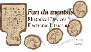
Which is a link that leads us to this:blogpost4

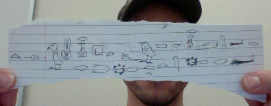
The “Fun da mentals” of e-lit. A very old image to teach us how to do something new. When I first saw this picture, I was immediately reminded of Robinson and his book The Story of Writing, and for some reason, the fossils reminded me of the section about “rebuses”. And with good reason, I think. These fossils are rebuses, and they relate to e-lit because most often, e-lit uses pictorial images. It’s crazy to think that we are still using techniques from the middle ages. But then again, everything we know has developed from something in the past. For example, the computer, and it’s many components (such as the internet, hypertext, and cyber text).

Hypertext is e-lit. But first, let’s look at the actual structure of this page that Devon posted. In my own opinion, it’s quite simplistic and bare. In fact, it even seems to resemble a piece of paper, which still shows that we’re relating how we write today to how we once used to write. However, the website seems to do a nice job of incorporating grids, as we learned about from Lupton. If we just browse at the first page, there is a cornucopia of blue. Blue, of course, is hypertext.  As Nelson wrote, hypertext means “forms of writing which branch or perform on request,”; in other words, any of the blue links that we see daily.

But how do these links happen? How can you possible think of making all of the connections? There are ways, tutorials, and even webpages that will do it for you, so it’s really not a question of how. It’s actually, more of a why. But the why is in the purpose of this blog post: electronic literature.

Now then, first we must learn to understand electronic literature. It’s unlike traditional literature, it’s not bound by specific outcomes and there’s no specific beginning or ending. So how can we learn about it with the idea of traditional reading and writing lodged in our noggins? With practice and coherence, it can be done.

Fun da mentals actually offers some interactive ways to learn and become familiar with electronic literature, which is something that Nelson writes is a good thing. There is a “hornbook” which helps students begin to understand how to read electronic literature. The hornbook teaches about nodes and paths, but also provides exercises that allow the students to get involved. By clicking on the “reader” section we can learn how electronic literature let’s us explore it. This section is headlined by “This sentence is false” and then teaches how different nodes (clickable parts of a sentence) can develop different stories or ideas, much like in The Jews Daughter.

The most interesting part of Fun da Mentals is the “Coloring book” link. As the only way to learn how to color is by practicing, at some point you learn that you’re doing it right when you color inside the lines. Students learn about creating electronic literature by doing similar exercises to that of a coloring book. It involves navigation by clicking.

Speaking of navigation by clicking, the Fun da Mentals is almost an example of  e-literature. Yes, it’s obvious that the page is full of hypertext, but what makes e-lit is that the reader is in control. He or she can click around and expand the story on their own. For instance, once I begin reading the description of “the coloring book” I see that the word “anatomy” is a link, in which I click it. It takes me to the anatomy interactive portal, which is not directly related to what I was just focusing on. In this same description, there is a clickable word that says “electronic tool”. I am compelled to find out what an electronic tool is, so I click on it. I read about electronic tools. However, here is where there’s an issue: Each page that I’ve clicked on, they’ve offered other links, but none of them seem to take me back to the original story line. Therefore, we could argue that this is not electronic literature.

Electronic literature can be complex, especially when we’ve grown up and only been exposed to one type of literature (traditional). It takes time and practice to learn a new trade. As Fun da Mentals is attempted to do, it’s important to constantly practice and enrich yourself into what you’re trying to learn in order to better adapt.

Categories: #IAMondays, Alphabetic Text Analysis, class activities, evidence, images, information architecture, mapping, pictorial images, semantic web, technology | Tags: , , , , , , , , , | 3 Comments

It’s time to transform with creative thinking

You’re currently reading words that are floating around on cyberspace. You’re not viewed as a reader, but as Aerseth writes, you are on your own adventure, taking risks. So, while we’re taking risks and exploring, Nelson mentions that most of us don’t actually understand the computer.  At first I thought that this meant we don’t understand how computers work, or even, how to operate computers and I expected to read something like a computer manual. Don’t get me wrong, Computer Lib / Dream Machine is certainly a manual of some type, but not the traditional manual.

Everything we’ve been reading and learning about recently has been quite the opposite of the traditional things we’re used to. I even though about writing this blog post in a different way, against the grain, but I had no idea where to even start; we must take baby steps. As Nelson argues, we learn most things by beginning with “vague impressions” (p. 303).  The first step in understanding the computer is to learn that it is a media that provokes emotions and helps us write, think, and show (Nelson, p. 306).

Now, the key word is help. It’s not the writer itself, nor it solely just the delivery method. For example, in Taroka Gorge (and the others too), a real human being came up with the basic structure: the main idea and the words. The computer put together the form and structure: how the words appeared to the audience. In the poems we read, there’s a feedback loop that keeps using the same words and creating different outcomes. I’m going to attempt to do so myself, but I have a hunch it’s much easier when a computer does it.

Roscoe retaliates to grab my banana whole heartedly.

My banana retaliates.

Roscoe grabs.

My whole banana.

My heartedly banana grabs Roscoe.

I think you get the point. Something that took me a few minutes to do would take a computer seconds to do. So in essence, it can be argued that computers essentially think for us, but not without the correct input.

But how do we learn what the correct input is? Well, as Nelson shows from the article,  “No more teachers’ dirty looks”, it’s beginning next to impossible to teach. Schools are focusing so much on standardized this and standardized that, that creativity is thrown out the window. Surely this is displayed in any type of creative situation, but especially in computers. How can the youth of the future learn how to be creative when computer classes are tailored to very specific tasks and are very standardized?  Furthermore, it can be said that the education system is behind in change. Literature teachers are teaching poems from a long history ago, yet they seem to glide over the current period of poems: e-lit at its finest.

Last week, we struggled, or at least I struggled, to understand the electronic literature we were required to read. We learned that it was difficult for us to tailor our traditional style of reading because it was all that we had known. If schools spend time teaching electronic literature, alongside traditional literature, students would become accustomed and be better able to code switch from one to the other.  As Nelson argues, “students should develop through practice, abilities to think,  argue, and disagree intelligently (p. 310).  But instead of this, students spend countless hours learning about topics that bore them to tears. One that I can recall, from both high school and community college, is the basic computer class that teaches you how to use Microsoft programs. Why is that a real class? And even more, it strictly taught and tailored the projects we would do. The whole class had to create an excel spread sheet from the same baseball statistics. How boring and inconclusive. And even more, these classes started the rave for PowerPoint, and we all know how Tufte feels about PowerPoint (which I think goes for all of us as well). I think it’s time the school systems caught up to the technology that is vastly developing.

The question about all of this, which Nelson asked as well ,is how will we use these creations? (p. 117). This is something that could truly be in our hands, yet it might also slip away if not treated carefully. School systems, and society, need to recognize these new ways of writing and creative thinking as a real possibility, and they need to begin to educate on them.  The time for transformation is now.

Categories: class activities, images, information architecture, mapping, semantic web, technology, Uncategorized | Tags: , , , , , | 4 Comments

Final Infographic and Reflections

InfographicFinal


Reflection 1

The goal of my infographic was to raise awareness about animal mills while also trying to convince people to adopt. I think people still see pet adoption as a less-than-ideal way to get a pet, because pets that are up for adoption are “second-hand.” I wanted people to see how adopting pets can help decrease the abuse animal mills perpetuate, and I wanted people to see that adopting does not mean you will be getting a “bad” animal. I think my use of icons and bright colors helps people clearly see my point. I wanted to use simplistic design to make my message the main focus, rather than complex design. The flow of my infographic shows how popular different pets are in the US, followed by statistics on animal mills. This may seem like an odd comparison, but I want it to point to the fact that many people who own animals unknowingly get them from animal mills. By following this up with details about animal shelters I wanted to show that they are a better alternative to pet stores and direct animal mill purchasing, because many animals die in shelters regardless of their good temperament and clean bill of health. In the end I reaffirm that there are multiple species of animals available for adoption, and I conclude with ADOPT written in large, bright pink lettering. I think I make it clear that adoption is a much better alternative to pet-store purchasing. I wanted to include more information about the pros of adopting, but with limited space and time I found it difficult. Piktochart is also not very user-friendly, so I found it hard to rearrange things, which I would have had to do if I were to add more information. I had a hard time trying to place objects without them jumping around from block to block, and I did not like that I couldn’t have images and text spread between two different blocks. I think it made creating the infographic more linear rather than free form. Surprisingly, I think I actually needed more physical room for my infographic. I would like to add a space that tells more about the availability of animals in shelters, including statistics about the health and breeding and species types of animals. I tried to cram some of that information in at the bottom of the infographic, but I think it would have been better if it were written out.

Reflection 2

I attempted to base my design largely on Tufte’s ideas. At first, I think I got caught up with Tufte’s “chart junk,” because I wanted to show my statistics with actual graphs. I was wrapped up in the preset layout which included charts–at first it seemed “prettier” and easier to understand. When I asked about it and reconsidered the best way to represent my stats, I came to realize it is much more effective and visually appealing to use icons as a visual representation of statistics. In my section about euthanasia in animal shelters, I chose to use cat and dog icons coupled with needles to represent the percentages of animals euthanized. This way, the graphic would not be filled with actual graphs, but visuals that showed the same information. I accompanied these visuals with a small amount of text, the minimal amount of text necessary to get the information across. My goal was to keep it clutter-free and straight forward. I also tried to group the information together, so that everything related could be seen in the same area, rather than forcing viewers to look all over and lose their trains of thought. Tufte believes both of these design choices are important to get information to viewers in the most effective way. Throughout my design I tried to make sure my visual enhanced and informed the alphabetic text, including the pink, red, green, and blue banners on the top section of my infographic. The statistics on animal ownership are accompanied by banners that visually represent the amount of animals owned in millions–meaning the largest banner is both first, and represents cats, which are the most owned in the US. I wanted all of my information to be backed up by visuals throughout, even in subtle ways. I included some arrows to help lead viewers’ eyes to related information as well, which Tufte uses in his own writing. For example, in my section about mill animals, I use an arrow to symbolize smoke coming from the factory. The arrow grows out of the top of the factory and leads the eyes to an explanation of animal mills. I wanted to arrow to serve two purposes. I also chose to use colors that were bright and eye catching. I did this for two reasons–first, because I wanted my infographic to grab the attention of virtual passersby, and second, because I wanted the bright colors to contrast with the information. Of course, bright colors are associated with exciting and happy things, but the information I am presenting is largely not. The contrast should be a bit shocking. Interestingly, the end message that convinces people to adopt does promote happiness and positive endings like the bright colors suggest.


Deciding which typeface to use for my infographic was tough. Like the color choice, I wanted the typeface to be inoffensive and calm. Fortunately, the default theme type included a sans serif header typeface that was long and smooth. I picked this because it was easy to read and didn’t really evoke much feeling. I especially liked it for the bottom “ADOPT” section because the typeface is very clean, no nonsense, and makes the message all the more straight-forward. For the main body text I chose a serif typeface that was equally clean, but a little more fun. I think the rounded, thick bowls seem remniscent of Comic Sans (yikes), but in a more sophisticated way. Again, I wanted the main body to be unobtrusive, contrasting the real message. The most important typefaces choice, to me, is my use of Courier New for my “hard hitting” statistics and facts. I chose Courier New because it is well known. CN is also associated with typewriter-like typefaces. I think using CN worked because typewriters are commonly associated with data, and much of the information I presented in this typeface was data driven. I also wanted it to stand out from the other more simplistic types. Unlike the other two, CN is thin and has tight leading. It stands out and because it is recognizable, it catches your eye.


Overall, I tried to make conscious decisions to follow the principles laid out by Lupton and Tufte. I think, for the most part, the choices I made based on their design ideas has enhanced the way I presented the information in my infographic.

Categories: infographic | Tags: , , , , , , , , , , , | Leave a comment

My infographic reflections

info2

Reflection 1

As a huge baseball fan, I wanted to find an aspect of the sport I could make an interesting presentation on (instead of Hey, so-and-so can still throw X amount of curve balls after X amount of years). In researching baseball-not uninfluenced by the amount of “42” trailers-I decided to investigate diversity in baseball. This was further revised to African-Americans and their presence in baseball. I’ve had arguments about this before, and many people simply say something along the lines of “It doesn’t matter what color a person is, baseball is just about how good you are as a player.” While this is true, I wanted to be able to illustrate that there are roadblocks keeping African-Americans from developing into major-league talent.

One of the problems I encountered with my first draft was a lack of any sense of narrative. I was all over the place. In this draft, I was able to focus on one group, which really helped me show change over time and offer reasons for the change. Since my topic is essentially disparity, I wanted visual reminders. To this end, I used graphs and color options to emphasize the differences. I also made use of the icons/images offered by Piktochart when talking about the reasons offered/suggested for why the African-American numbers have dipped, as well as areas in which baseball is trying to improve. I did this because I thought visuals would make the socio-economics that act against integration more concrete.

Many of the design problems I encountered came from the website’s interface. While I was able to graph the 75/856 African-American player representation, I was unable to present more information in that style graph because Piktochart informed me I did not have access too it. This resulted in my having to try to scratch-graph it, which explains why some of the baseballs in the second graph in that block are a bit wonky. I think Piktochart would benefit from some sort of “auto-align” tool for different columns/grouped information.

During revisions, aspects of my presentation (icons or what have you) would sometimes disappear for several sessions, which was unnerving. I would replace it in the infographic, and then the original would reappear sometimes days later. I also feel that Piktochart is a bit over-eager to group things together. Adding/changing text formats was annoying-it would revert to false in whatever font/color/size you wanted to change too, instead of simply changing existing fonts. As a first time Piktochart user, I felt the walk-through tutorial could be a little more robust and in-depth.

I feel that an infographic was a good approach to showing rather than telling, to acknowledge opposite arguments and refute them.

Reflection 2

I wanted my infographic to be beautiful evidence. So in constructing my presentation, I knew that there were definite Tuftean principles I wanted to apply. Firstly, due to spatial considerations, I, like Tufte, would need to become a proponent of visual density. The infographic is a very finite space, and given my topic one that I needed to make the most of.  It was at times difficult to strike a balance. It was in finding a balance that I began to experiment with font styles and size in order to maximize my real estate.

To avoid overpopulating my infographic, I relied partially on using the layout of the theme to separate and compartmentalize ideas. Tufte recommends keeping related information at eye level,  so readers understand that the information is connected (Tufte p.91). By quasi-cartouching, I hoped to avoid presenting a confusing and difficult to read column of text and image. So, I hope to have made it easier to differentiate between ideas in my infographic without having made my presentation choppy.

Font use was another way I attempted to distinguish between information types.I limited myself to 5 fonts, 4 font sizes, and 3 colors during my presentation. I wanted to use group information by font, so that when readers saw a font that had been previously used in my presentation, they would automatically make a link between the two pieces of information. I also but a lot of thinking into font selection, as Ellen Lupton, author of Thinking With Type, writes that there is a whole history and metaphor/ emotive aspect to font selection. Going off of this, I picked very clear, thin, almost severe “hard” fonts for factual information, and a wider, more spacious, “softer” font for quotes. I was my intention to use these alternative fonts to mimic the idea of “hard facts.” Courier New has a sense of coldness (I think, due to the thinness of the characters), so I used that font when talking about the real world and it’s inequality. Likewise, I chose a font for the quotes that counterbalanced this, reasoning that the quotes are from people trying to put their own spin on the situation, and thus are a bit inflated.

I think producing an infographic is a great working example of a selection from Tufte’s book ” whatever evidence it takes to understand what is going on” (Tufte p. 78). Piktochart offers a lot of images and icons, which could easily be converted into the type of distracting “phluff” as Tufte calls it, that litters many PowerPoint presentations. The challenge is to use these images as a mode of information, or as repetitive information. In my infographic, I use visuals (baseballs for timeline, a schoolhouse, etc) to reinforce the topic. This can be used to particular affect in graphing.Instead of using a pie or bar graph, which provide abstract visuals, I chose to display my data in a more visually appealing way. Instead of impersonal lines and circles, my graphs recall humanity. Further, the use of color and countable icons in my graphs is superior to visually abstract pie/bar charts when trying to project disparity.

I tried to show forward progress (where it existed) and used comparison whenever possible. Tufte argues for comparison when presenting data, as it provides context to information. So, for everything I touched upon, I tried to provide a scale. Without such knowledge, we can’t really ascertain if there is a problem. Scale comparison was especially important to my presentation, as it is about a group being marginalized. Instead of just saying there is a problem in baseball now, we must look at this years number as it relates to the whole history of African-Americans in baseball. We must look at contributing factors, and compare the African-American baseball population to African-American total population. Only through examining these factors can we accurately declare that there is a real problem with the number of African-American players represented.

I relied heavily on Tufte and Lupton’s theories in designing my infographic. Without their influences, I feel that my presentation would have been “pretty” (if I was lucky) without really having anything to say, which is a damnable sin in evidential presentations. Being able to go to their works for reference helped me understand way of putting content first, then using other aspects of the presentation as enhancements.

By using Lupton’s approach to layout, I feel that my attempt at a Tuftean infographic was as successful as a first-timer could be.

Categories: #IAMondays, baseball, class activities, diagrams, evidence, infographic, information architecture, tufte | Leave a comment

Publication Infographic Final

Infographic 3

Reflection 1:

My inspiration for this infographic was based on my recent research into the field of publication. I’ve found that there is a lot of confusing information out there, and most people I’ve spoken to don’t seem to understand all of the same ideas. For example, I have some writer friends on Twitter who are very excited about self-publication, but who don’t really know how it works or how much money they can expect to make. I thought it might be useful for them to have something that showed the important information all in one place.

Since the questions many writers face with publication usually involve decisions between one path or another, I decided a comparison of the various types of publication would be the most useful. From the beginning I planned to have a variety of three-way comparisons that would clearly lay out some of the major differences. This way people can see clearly what their options are, and make easy visual judgments about what is the most common, popular, or useful to them. A lot of the information I found normally didn’t make the comparisons as clear; the numbers were usually spread out in separate paragraphs without any direct explanation to link one number to another. This created some confusion, such as the articles I read making it hard to tell when they were referring to overall publication statistics, print books, or ebooks. Some of the numbers were left out of those articles entirely, and I had to extrapolate them (for example, the 6% of books being independently published weren’t mentioned at all, and I had to figure out that number after subtracting the self and traditional publication numbers).

One of the biggest limitations I found was that piktochart didn’t seem to have any good options for helping me align the various icons and background shapes I used. I had to eyeball a lot of things, and I feel like under close examination there will be visual flaws in the layout. I would have preferred if the program had a tool similar to Prezi’s that showed me when two objects were the same size, centered correctly, or aligned on the same horizontal or vertical point as each other.

I also felt I generally lacked enough artistic skill to make the layout visually appealing. I had to judge color choices and shapes simply by what I thought looked good. If I were to make an infographic in a professional environment, I would probably want to work together with someone with more artistic skills, collaborating on the design but letting the other person make the graphical choices while I did the writing. Either that, or practice enough myself to attain a higher level of skill than what I had here.

Reflection 2:

I laid out the text of the infographic with two types of hierarchy in mind. One was a change in color, which Lupton suggests can be uses for emphasis (p. 132) instead of italic or bold font. I decided that the headings for each grid would stand out well in color, compared to the plain white font I used for most of the text. Since I was laying out the text in a nonlinear fashion, I thought this emphasis would be a good way to draw the reader’s attention to each heading first. If I had been writing a normal paper where everything was linear and the reader followed the text from the top to the bottom, headings could have simply been placed between paragraphs, possibly in a larger font size. The layout of the infographic, however, meant that sometimes the headings were either above, below, or to the side of the information they related to. I felt this meant they needed to stand out in some way.

A second hierarchical method I used was simply changing the font size. The headings for each grid are in the largest size, the sub-headings (such as for self, indie, and traditional publication) are in a smaller size, and the main blocks of informative text are in the smallest. I wanted to avoid excessively fancy font choices, since they would have been unnecessary and distracting. Likewise, I avoided adding too much fancy imagery in the text frames, and stuck with simple colored blocks as backgrounds. I felt that either fancy font or excessive imagery would be what Tufte calls “chartjunk” (p. 152). Even some of the basic icons picktochart provides seemed like they would be content-free distractions and pointless decoration, which Tufte disapproves of. I therefore kept my use of icons to a minimum.

I tried to use a consistent color scheme throughout the infographic, in order to avoid distraction and unnecessary decoration. Even though I was already using simple colored blocks, I felt that too much color would make the infographic harder to read and ruin the continuity of design. Even when choosing my initial template, I avoided ones that seemed too “busy.” Pointless color and cartoonish design would have gone against Tufte’s suggestions that a design should be clear and efficient (p. 79).

I also attempted to make visual comparisons easy to see as a supplement to the numerical information being shown. Tufte suggested that information always needs to be compared with something specific and appropriate (p. 127). He also discusses how a good graphic should visually show the ratio between different statistics, with text included right alongside the graphics. Piktochart didn’t really allow me to make precise measurements, so I settled for rough size differences in the backgrounds on the ebook publication comparisons, with the 87,000 total ebooks in the largest box, and the 12,000 that were independently published in the smallest box. I then supplemented this with icons that give a quick visual comparison (1 book icon = 10000 sales).

The sections of the infographic were laid out to keep related information close to each other. I wanted to make sure that when the reader looks at the infographic, they can easily tell which information is related and should be considered together. Tufte suggests keeping relevant material within the common visual field (p. 91) in order to keep them unified. I kept this in mind when laying out each grid, so that all the information on print books is together in one place, ebooks in another place, distribution of money in another, and so on. Also, even though most of the grids have a three-way comparison between different pieces of information, I made sure to use a slightly different design on each. The first is triangles, the second rectangles, the third parallelograms, etc. This keeps each grid self-contained as its own block of information, with the intent of guiding the reader to view each grid as if it were a separate “page.”

All together my approach was to use simple design, with the goal of keeping the infographic plain while remaining visually appealing. The focus was on the content, not on artistic design for the sake of artistic design.

References:

Lupton, E. (2010). Type (2nd Expanded ed.). New York, NY: Princeton Architectural Press.

Tufte, E. (2006). Beautiful evidence (3rd ed.). Cheshire, CT: Author.

Categories: infographic | Tags: , , , | Leave a comment

Create a free website or blog at WordPress.com.